Table of Contents
⚠️ This article is outdated
We’ve updated and consolidated our design guidance! For the most current information on customizing your event visuals, please visit our updated guide: Branding Your Event


The landing page for a Goldcast event contains a Hero Background that you can customize using the Look & Feel tab in the event dashboard.
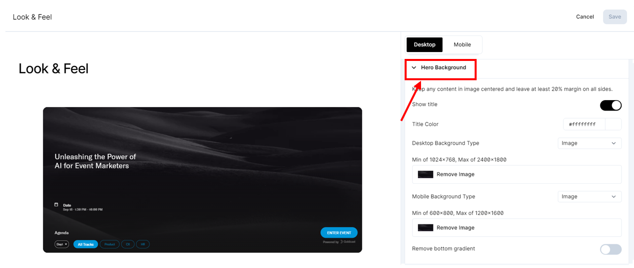
Hero image alignment
The event landing page background image alignment changes from screen to screen since it adjusts based on screen size. What your monitor shows you can show differently (possibly cut off towards the top) on another person's monitor. To avoid the top of the background image getting cut off, we recommend aligning the focal point of the images toward the center of the screen.
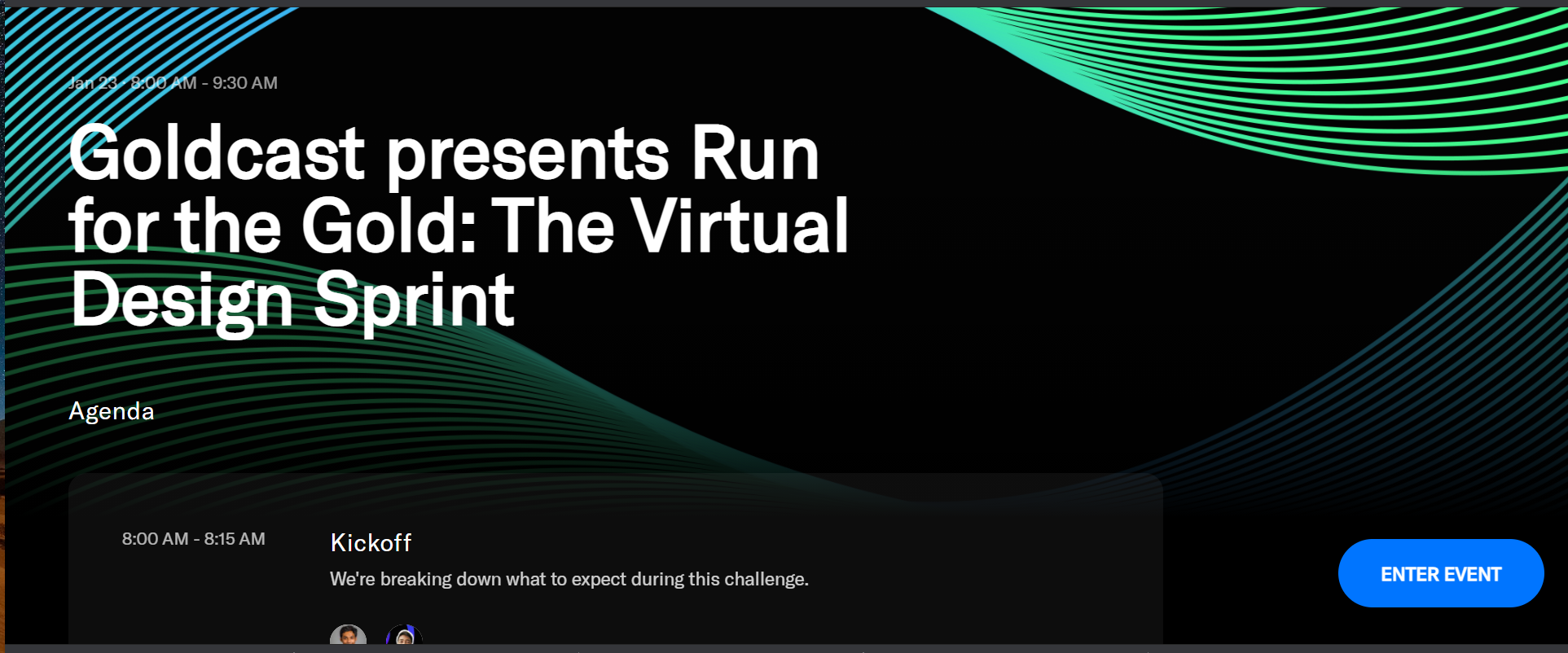
Essentially, creating some padding around your image will pull it down for optimal alignment. This is best demonstrated with a background that includes the event name, date, and/or an image. For example, let's say you'd like this to be the event background:
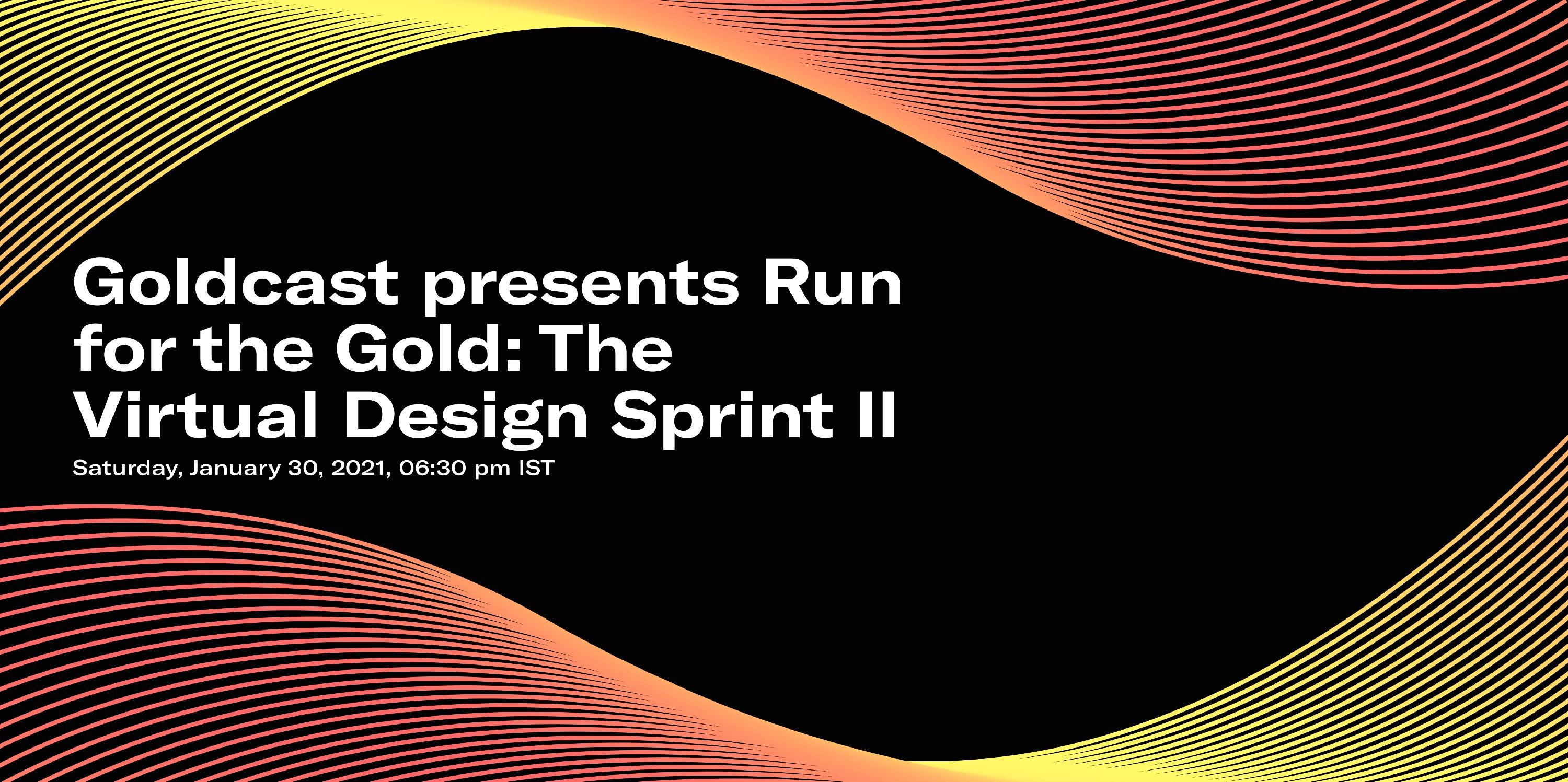
When you upload it as a background image, on some smaller monitors, it will appear as:
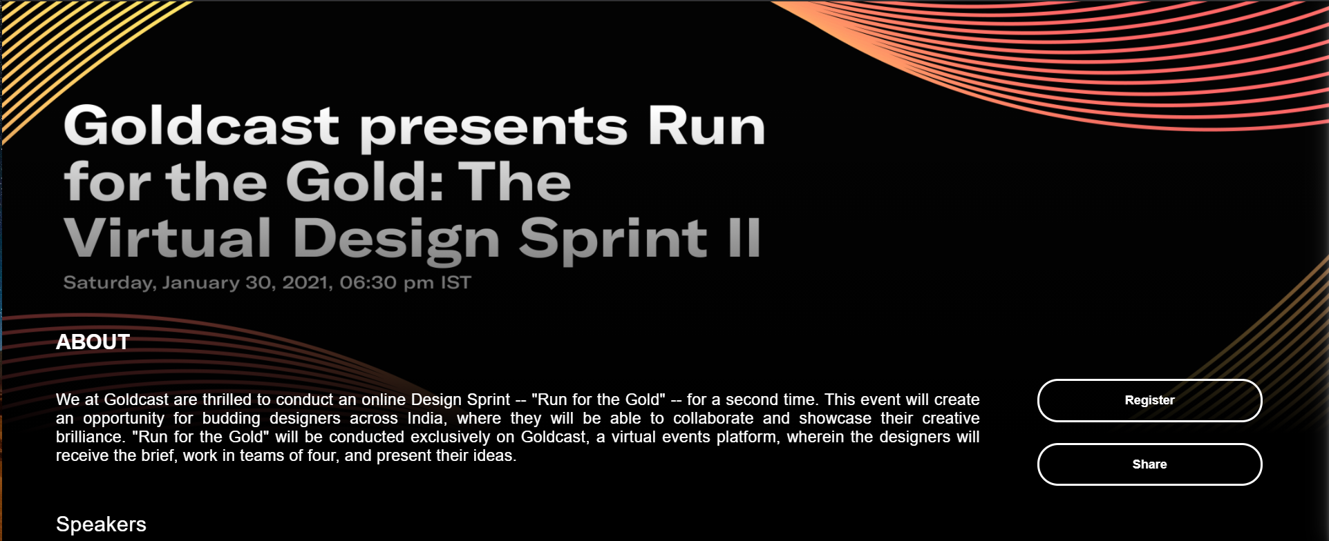
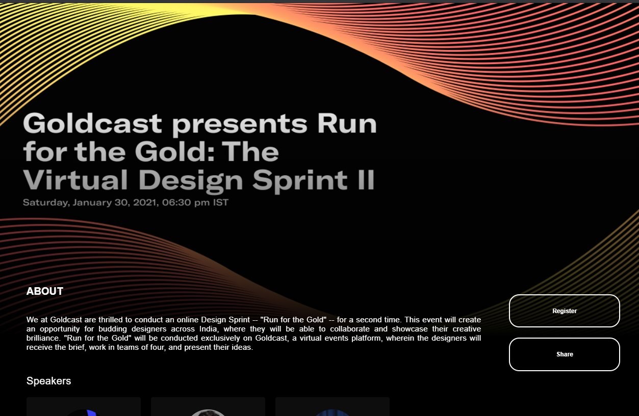
On larger monitors, the background image area may not be as limited and can look fully intact, as shown below:
This is why we recommend expanding the space around the edges of the background image. Increasing padding around the border to continue the image's graphics will push the focal point to the middle of the screen.
Another thing to remember is the shadow overlay we include on the event page. It works very nicely for events that include the title over the event image, as shown below:
As you can see, it brings the background, foreground, and additional details together smoothly for a refined transition to the eye. This is our default recommendation for events. However, we urge people to get creative and customize their events to look exactly as they like. This is why we have the option to embed the date and title into the background image.
Hero image specifications
If embedding the title, date, or any image into your background, we recommend doing so with these parameters in mind:
- The recommended dimensions of the image are:
- Desktop: Minimum of 1024 x 768 px; Maximum of 2400 x 1800 px;
- Mobile: Minimum of 600 x 800 px; Maximum of 1200 x 1600 px;
- Keep readable/important content within a 10% border of the image.
- If you want content centered across any axis, it should be in the center of the image, which will reflect in the center of the landing screen (but the borders should still be at least 10% on either side).
- The focal point is 50%, 50% (the center of the image).
- The gradient overlay is aligned to the bottom of the image, and its height is 60%px relative to the size of the user's window.
- The border radius is 0px.