Table of Contents
The registration page sets the stage for your event and is your first chance to engage and captivate your audience. A well-designed page generates excitement, provides attendees with event information, and convinces them to register. In this guide, you'll discover how to use the Goldcast Page Builder to create a fully responsive custom registration page for your event.
How to create a registration page
For Webinars
- Log into Goldcast Studio and open your webinar.
- Once on the webinar dashboard, click the Registration tab on the top.
- Click the Registration Page button.

- This opens the Page Builder. You can add, customize, and style the blocks to build and design your registration page.
- Once done, preview your design and click Save.
For Events
- Log into Goldcast Studio and open your preferred event.
- Once on the event dashboard, click Registration → Page & Form on the event navigation sidebar.
- Click the Edit button in the Registration Page section.
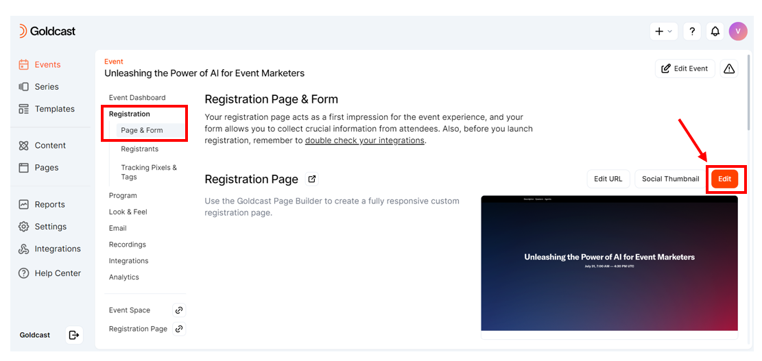
- This opens the Page Builder. You can add, customize, and style the blocks to build and design your registration page.
- Once done, preview your design and click Save.
How to use the page builder
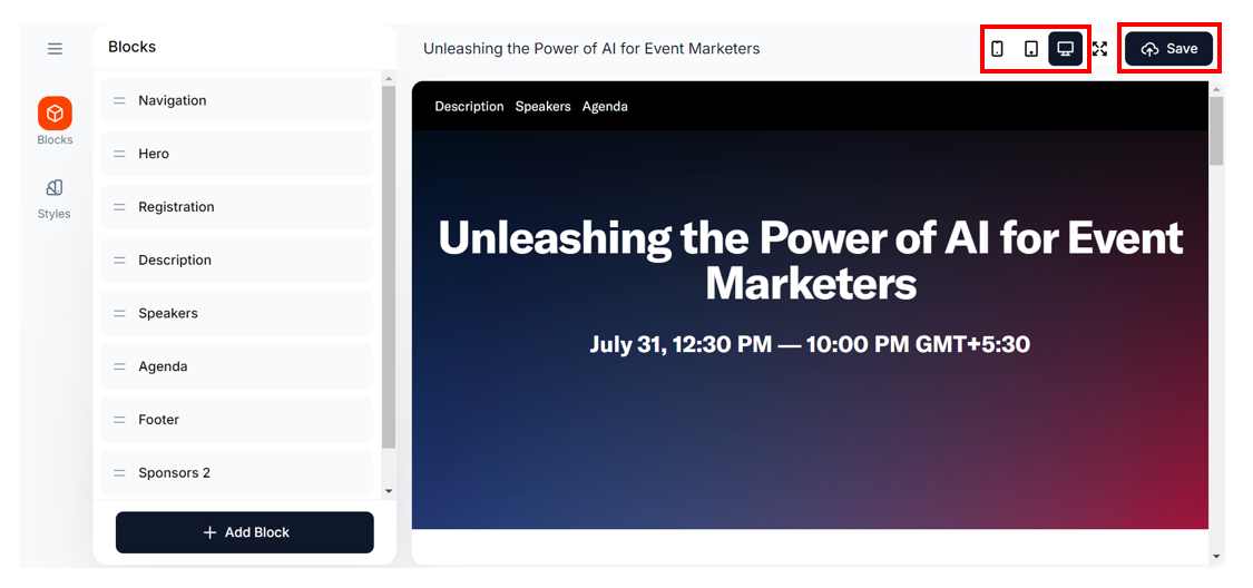
Goldcast uses an easy-to-use, drag-and-drop page builder to help you quickly design and customize your registration page. You do not require any coding skills to use the builder.
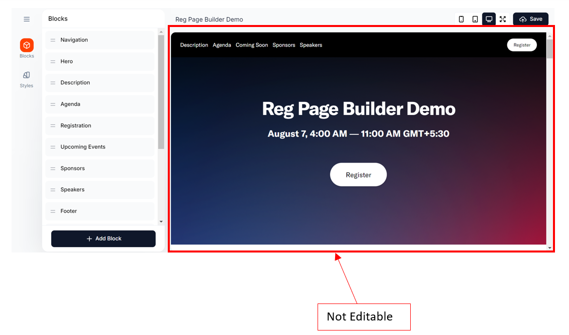
- The left side of the WYSIWYG builder allows you to add, delete, reorder, and style the different blocks on your registration page.
- The right side displays the page preview.
- Use the preview icons at the top of the page to visualize how the registration page would appear in different screen sizes (mobile, tablet, and desktop).
The right side of the page is not editable. To change anything on this page, you must use the left-side menu.
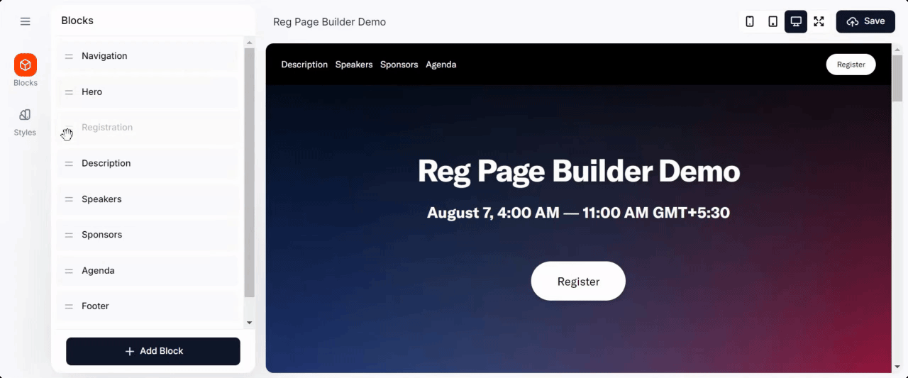
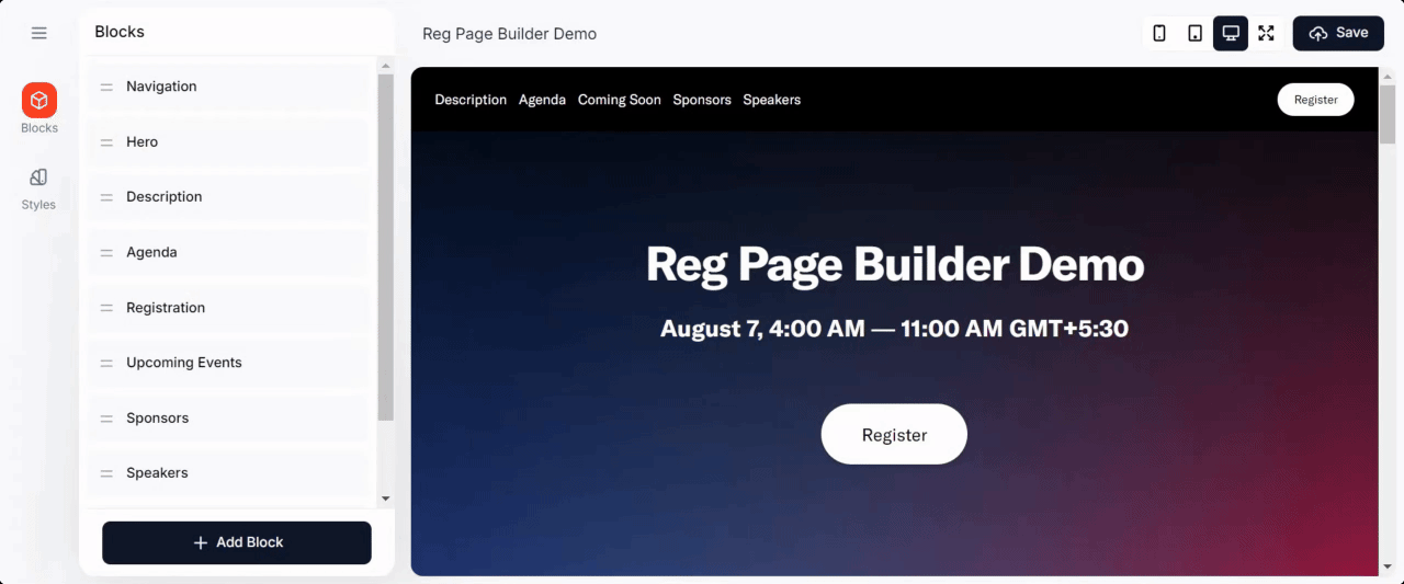
Blocks
Goldcast uses blocks to build the different sections of your registration page. These blocks are stacked on top of one another and contain elements such as headings, paragraphs, forms, buttons, images, etc.
When you open the Page Builder for the first time, you'll notice that the blocks Navigation, Hero, Registration, Description, Speakers, Sponsors, Agenda, and Footer are included by default in the page. You can reorder, hide, remove, and style these blocks individually. You can also add additional blocks as required.
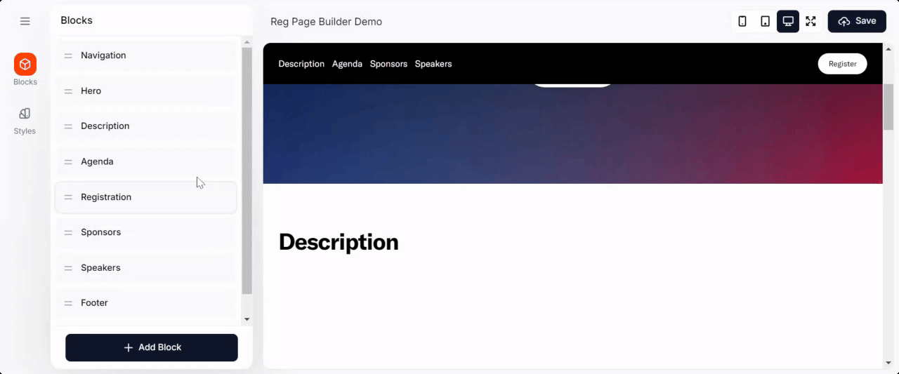
Reorder
To reorder blocks, drag and drop each block using the two horizontal lines in the left menu.
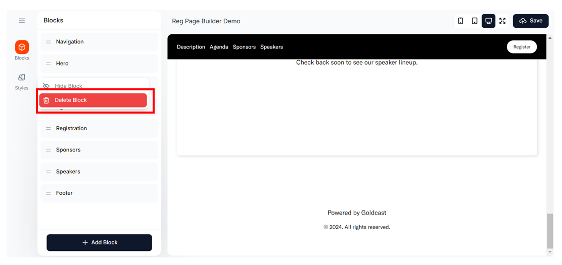
Delete
To delete a block, click the three vertical dots icon next to it and click Delete Block.
Hide
To hide or unhide a block, click the three vertical dots icon next to it and click Hide/Unhide Block.
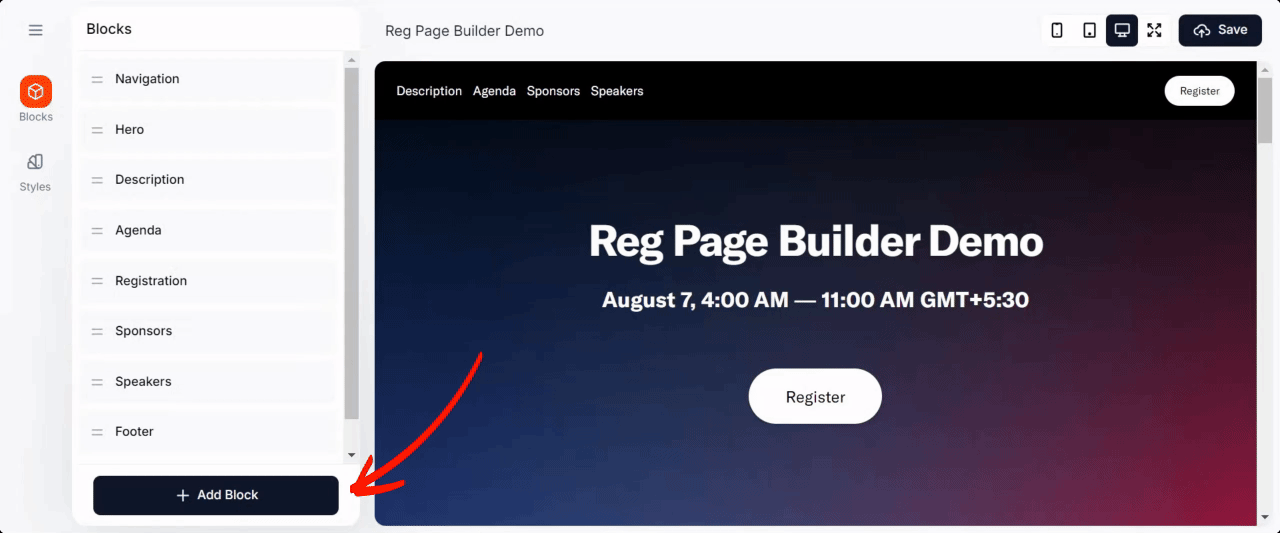
Add
Click the +Add Block button at the bottom to add a new block to the page. Once you add a new block, it will be added to the bottom of the page, and the preview on the right will automatically scroll to the newly added block. You can then drag and drop to reorder it.
The newly added block will automatically be added to the Navigation block. However, it will be hidden, and you'll need to unhide it to make it visible in the navigation bar at the top of the page. For the new block to be visible in the navigation header,
- Click the Navigation block in the left menu.
- Select the Content tab and click the eye icon to make it visible.
- You can also edit the block name to customize the menu name for this block.
- Once you are done editing, the Navigation bar will reflect the edited name.
Edit
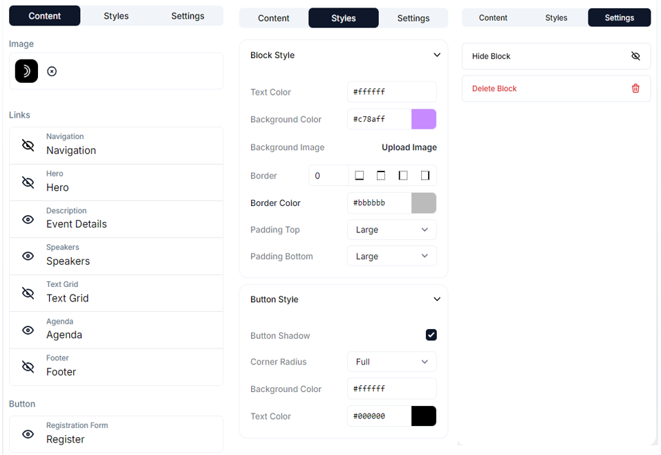
To edit a block, click on it in the left menu. This will open the editing section, which is divided into three tabs:
- Content: To change the content and its styling.
- Styles: Change the style of the overall block and button (if applicable).
- Settings: Hide, unhide or delete the block.
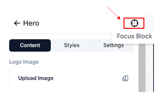
Pro Tip: While editing a block, click the Focus icon at the top to lock it in place. This way, you don't have to keep scrolling while editing, making it easy to view the changes you make on the right panel.
Content style
You can customize the font styling for the Headline and Text for each block. To view the styling options for each element, click the swatch icon. Here is a brief description of how each of these styling settings works:
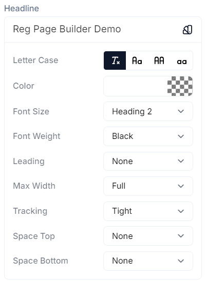
- Letter Case: You can choose from title, sentence, upper, or lower case.
- Color: This controls the color of the text. By default, it will inherit the block text color. If the block text color is blank, it will inherit the page text color. To change the color, enter the hex code or click the color preview to open the color palette.
- Font Size: This controls the size of your text. We have defaults applied to each text section in the block. You can choose different-sized headers for the block Title and Headers. The other elements, like description, agenda, button texts, etc., have fixed font sizes and cannot be edited.
- Font Weight: This setting controls how thick or thin the characters of the text should be.
- Leading: This setting controls how the text is spaced vertically in lines or the spacing between adjacent lines.
- Max Width: This controls the maximum width of your text. For instance, if the event title is lengthy and you prefer the title to be contained instead of running the entire length, you can use this option.
- Tracking: This controls the spacing between the characters of your text.
- Space Top: This controls the spacing or padding above your text.
- Space Bottom: This controls the spacing or padding below your text.
Block style
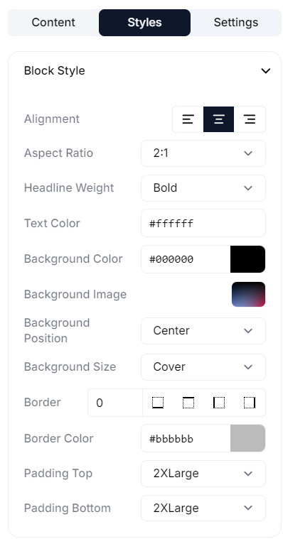
This tab allows you to customize the overall style of the block by changing various settings, such as alignment, aspect ratio, background color, background image, text color, padding, border, and size.
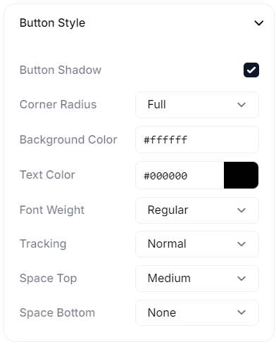
Button style
Just like the content, you can also style the buttons in a block.
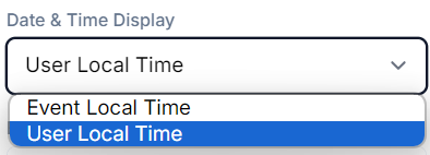
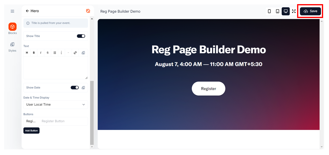
Heads up! If you have any element on the registration page that displays the date and time, you can choose to display it in the user's local time or event time.
Styles
The first time you open the registration page builder, Goldcast applies the default page style to your page—white background, black text, and font style Default-GT-America. To change this:
- Click the Styles tab on the left sidebar, and make the necessary changes.
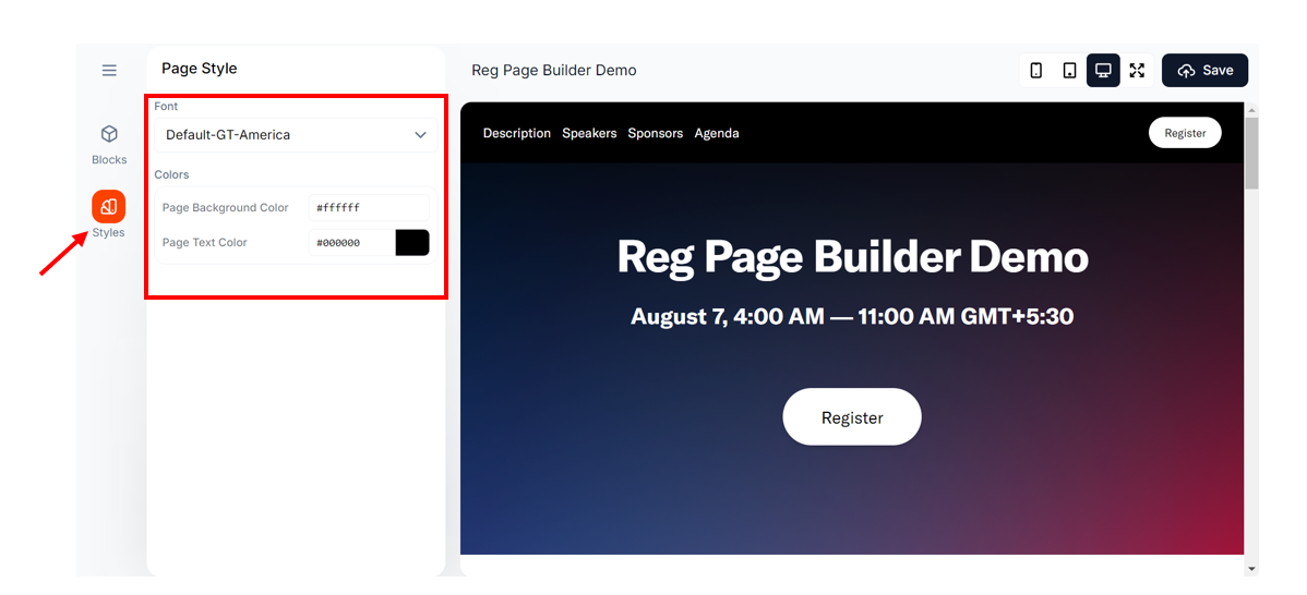
Heads Up! Any changes you make here will impact the entire registration page. You may also choose to change the style of each block on the page individually.
Preview
To preview the page, click the mobile/tablet/desktop/full-screen icons at the top. This will show you how the registration page will look on different screen sizes.
Save
To save changes to your page, click the Save button on the top-right.
Exit
To exit the page builder, click the hamburger icon on the top-left and click Save and Close.
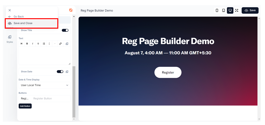
If you click Go Back without saving your changes, you'll receive an alert asking if you want to exit without saving.
Block types
Let's take a closer look at each block available on the page builder:
Navigation

This block controls the top navigation bar on the registration page. Like all other blocks, the navigation block is completely customizable:
- You can turn it on or off
- Choose the navigational links you want to display here. Change the display text of each block.
- Add a logo
- Include/remove the register button
- Customize the size and appearance of each menu item, and more
Use the Content, Style, and Settings tab at the top of the block to modify various aspects of it.
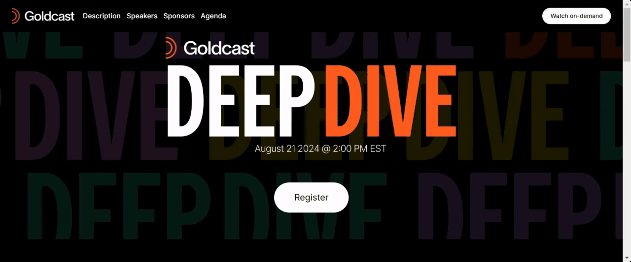
Hero
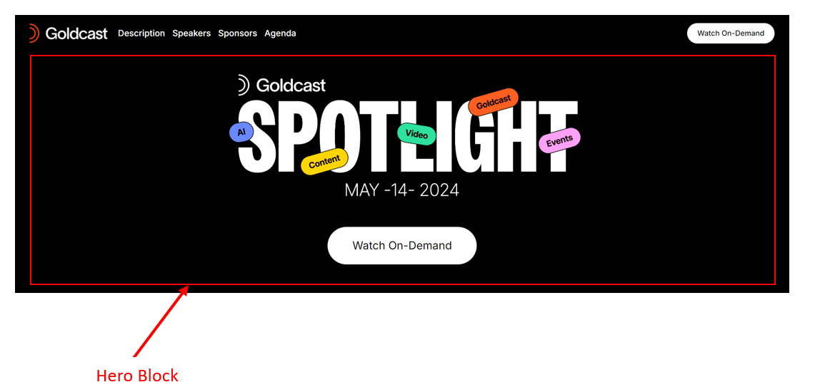
This is a large, full-width area at the top of the registration page that displays the event title and date. It usually includes the Register CTA button.
Note: All Goldcast users can now select images directly from the Unsplash library when building pages in the Page Builder. This integration makes it easy to add fun, high-quality visuals to any image component without needing to create or upload your own — a quick way to bring extra spark to your event pages!
Image Hero
You can use this instead of the Hero block if you want to use an image that has the event title and description within it. This block also includes the Register CTA button.
Description
Displays the event description.
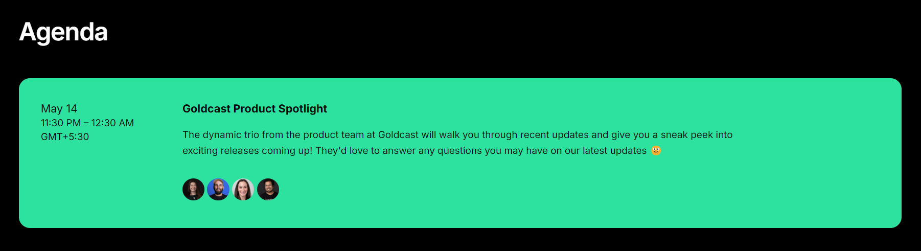
Agenda
Displays the event agenda.
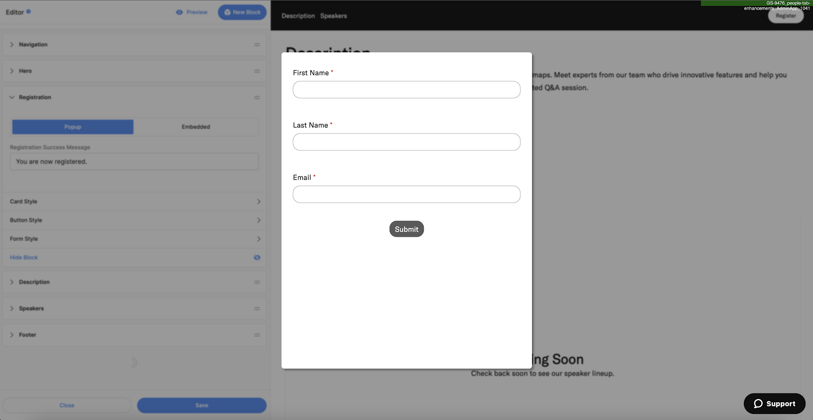
Registration
Every Goldcast registration page will have exactly one Registration block. This block cannot be deleted, but it can be hidden. You can set your registration form to be in either Embed or Popup Mode.
In Popup mode, the registration form will popup over the registration page when one of the Register CTAs on the page is clicked like so:
In Embedded mode, the registration form is embedded directly into the page at the same level as all the other elements on your page. It will be a block split between a text area and the form. Clicking on the register CTAs on your page will auto-scroll the user to the registration form embedded in your page.

In Embedded mode, you can enhance your registration form in several ways:
- Add a headline that appears above the form to provide context or branding.
- Customize the form width to better fit your embedded layout. The video below demonstrates how to adjust the form’s width step-by-step.
- To improve user experience, you can automatically scroll visitors to the form block when the registration page loads by adding
scroll-to-form=trueto the end of your registration URL.
Here is an example registration page URL that auto-scrolls to the form: https://goldcasttest.registration.goldcast.io/events/dccdd791-ee4e-4342-afd0-6c756ad78f0c?scroll-to-form=true
Besides using the default Goldcast registration form, you can also embed external forms built on Marketo and HubSpot on the Goldcast registration page. You will view these options in your Register block in the form style folder, along with the option to use Goldcast forms.
By default, your Goldcast form is selected, and the registration form from your Goldcast Library is used. For more information:
Sponsors
A block for showcasing event sponsors.
Speakers
The Speakers block automatically pulls in speaker details from your event. It displays the speaker details you've added in your event in a grid. Use the Content, Styles, and Settings tabs to change the description and appearance of this block.

Pro Tips:
Style the Header & Text
Click the Swatch icon  in the Header and Text sections to control the styling of these components.

Style the Speaker Cards
Click the Swatch icon in the Speaker List section to modify the appearance of the Speaker Cards, Image, Names, Secondary Text (Speaker Title), and Social Links. Currently, it's not possible to reorder the speakers in the Page Builder. Reorder the speakers in the Speaker section in Studio, and it will be reflected here.

Modify Speaker Columns
To modify the columns in the speaker grid, click the Swatch icon in the Speaker List, expand the Card Style section, and use the Grid Columns dropdown to set your desired number of columns.
To remove the visible column lines in the Speaker Grid, click the Swatch icon in the Speaker List, expand the Card Style section, set the Space Between dropdown as None, and the Shadow Color to your desired color. This creates a continuous block effect instead of separate columns for each speaker.

Customize Headshot Style
Click the Swatch icon in the Speaker List and expand the Card Style section. Turn off the Show Photos toggle to remove speaker images. Use the Aspect Ratio dropdown to customize the headshot style.
- For square headshots, set the Corner Radius as None and Aspect Ratio as 1:1 Square.
- For circle headshots, set the Corner Radius as Full and Aspect Ratio as 1:1 Square.

Add Company Logos
Use the Company Logos section to add a brand logo for each speaker on your list.

Upcoming Events
Displays the title, date, time, and the registration CTA of upcoming events in your Goldcast organization.
Heads Up! You can customize which of your upcoming events to display here.
On-Demand Events
Displays the title, date, time, and the registration CTA of on-demand events in your Goldcast organization.
Heads Up! You can customize which of your on-demand events to display here.
Videos
Display one or a set of videos to support your registration page content.
Heads Up! Videos on event, series, and repeating event registration pages do not support Analytics tracking (ie. views, watch time) at this time.
-
Add the Video Block, then click +Add Videos to select the videos you want to feature in your page. This opens your Goldcast Content Library.

- Select the videos you want to feature in the video block. You can mix-and-match and select any number of videos. There are no restrictions on the number and type of videos included on the hub.
- Click Save. Your selected videos will now appear in the Page Preview on the right.
- Use the two horizontal lines icon to drag and drop videos to rearrange their order on the hub page.
- Click on each video to customize the video's title, thumbnail, and description.
-
Scroll to the Layout dropdown and choose your preferred layout:
- Grid: Displays videos in a horizontal grid. To change the number of columns in the grid, click the Swatch icon next to the Video Blocks, click Card Style, and use the Grid Columns dropdown to set your preferred number of columns.
- Carousel: Displays videos with horizontal scrolling. Click the Swatch icon next to the Video Blocks, click Card Style, and use the Carousel Button section to style the carousel button as needed.
- Grid: Displays videos in a horizontal grid. To change the number of columns in the grid, click the Swatch

Call To Action
Use it to add a call-to-action button as a separate block on the registration page.
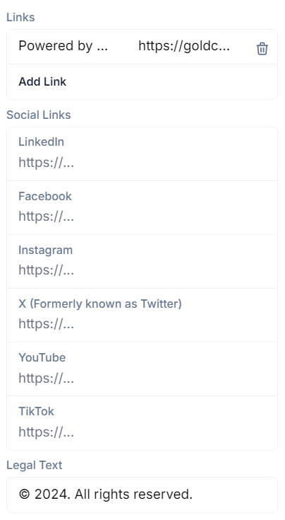
Footer
Page footer to display social media links, legal text, and other info.
Besides the event blocks mentioned above, you can also add custom blocks that you can configure as needed. The available custom blocks include:
Text/Image Split
This is a full-width block, with one half containing a text component and the other half an image.
Suggested specifications: 4x3 aspect ratio. This image will stretch taller to match the height of the text in the block.
Full-Width Image
Displays a full-width image that spans the entire page.
Suggested specifications: 4x3 aspect ratio, between 1600px - 2400px wide
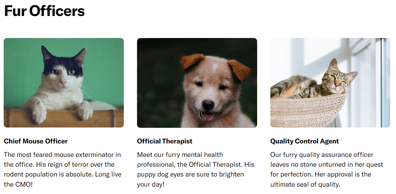
Image Grid
This block displays a custom grid of up to 12 images. You can choose the number of images you want to display.
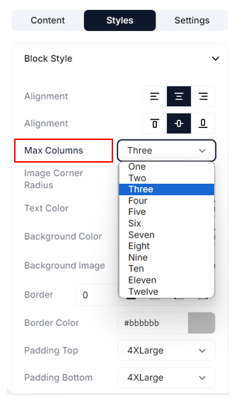
Ensure you set the Max Columns field in the Styles tab to accommodate the number of images you choose for your grid.
Pro Tip: For the best results, we suggest using SVG format images with transparent backgrounds and keeping the aspect ratio uniform (2:1, 1:1, etc.) for all images.
Text Grid
This block adds a 3-column text block on the page. You can also include images within each text column.
Pro Tips:
- Click the Swatch icon to modify the image's fit, position, and background color.
- Navigate to Styles → Items Style to modify the appearance of each item in the text grid: Image, Heading, and Body.
- You can change the size, color, and padding space for the heading and body of the text columns.
- Suggested image specification: 4x3 aspect ratio, with a minimum width of approx. 250px. The image size and crop will adjust depending on the number of columns in the grid and the size of your browser window.
Location
Displays a Google Map with location pins on your registration page. To know more, refer to how to add a location block.
Design Tips
Here are a few tips and best practices to help you optimize the design of your Goldcast registration pages:
Hero image design guidelines
How should I create my hero image to ensure it looks great in any browser size?
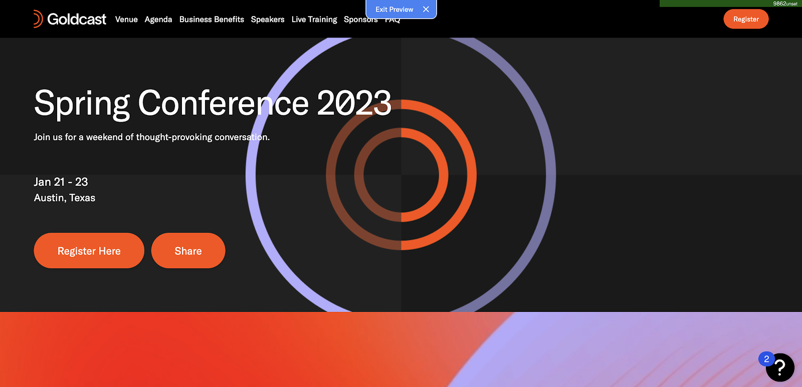
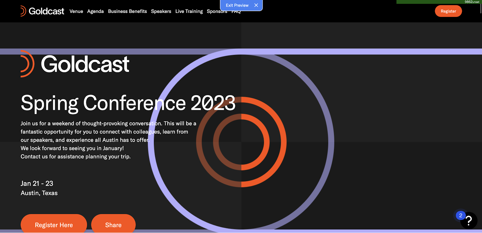
To compensate for the challenge of infinite screen sizes, Goldcast uses a “background cover” strategy for hero images. The image will crop on the left and right if the browser is tall and skinny. If the browser is wide and short, it will crop the image on the top and bottom.
The content inside the target purple circle of this sample image will be visible in all browser sizes. Depending on screen size, the top, bottom, left, and right of the image may be cropped.

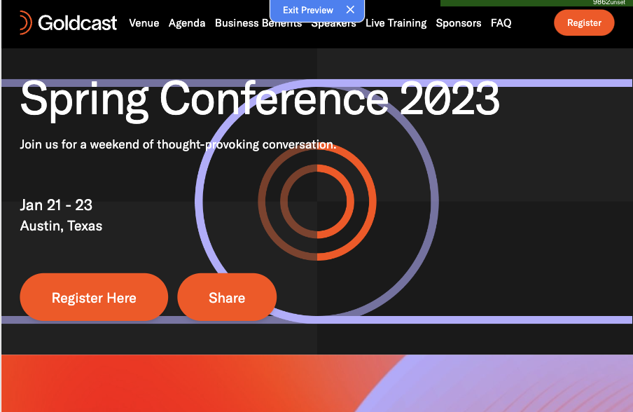
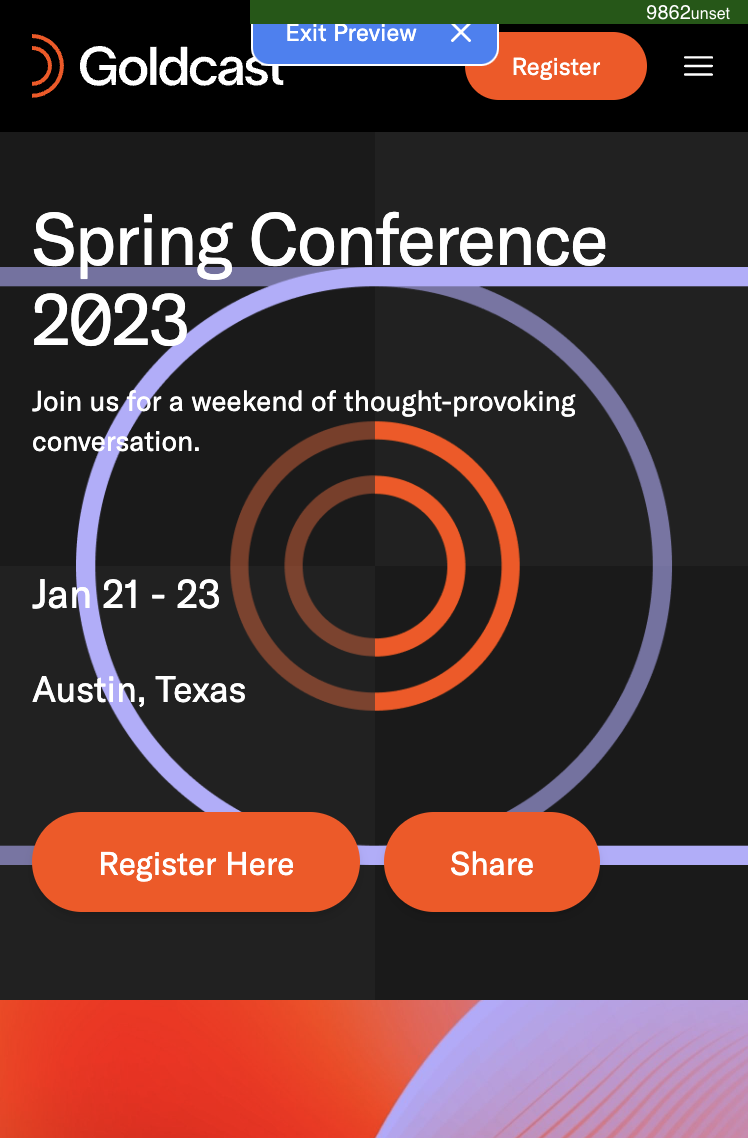
The hero block also has a variable height - it expands to fit the amount of content displayed. For example, if a logo and a long description are added, the hero image will be taller to cover the background of the content.
|
No logo, short description. |
With a logo and a longer description. |
Pro Tips for creating an eye-catching hero image: When choosing a hero image for your event, avoid backgrounds or text that could distract from your event name, description, and date. We suggest using our preview feature to check your website's appearance on different screen sizes before publishing it, ensuring everything appears as intended.
Suggested image specifications
Here are some suggested specifications for different images on various registration page blocks. Remember that as the content on your page, the layout of each block, and the size of your browser change, these images will shift to compensate.
| Image Type | Specification |
|---|---|
| All block background images | 4x3 aspect ratio, between 1600px - 2400px wide |
| Navigation bar: Logo | Approx. 32px tall, width not greater than 150px |
| Navigation bar: Background image | Approx. 66px tall |
| Hero logo | Approx. 80px tall, any aspect ratio |
| Full-width image | 4x3 aspect ratio, between 1600px - 2400px wide |
| Text grid image | 4x3 aspect ratio, with a minimum width of approx. 250px. The image size and crop will adjust depending on the number of columns in the grid and the size of your browser window. |
| Image/text split | 4x3 aspect ratio. This image will stretch taller to match the height of the text in the block. |
Pro Tip: Large images can slow down the page's performance. To ensure the registration page loads quickly, you can:
- Use image optimization tools to compress your images without compromising resolution quality.
- Consider opting for the .webp format for large images to reduce file size and page loading times.