Table of Contents
When creating a Goldcast event or webinar, it's important to set up the registration form before opening event registration. This form will be displayed on the event registration page, and once attendees sign up using it, they'll receive a unique magic link that grants them access to the event.
Create Registration Form
For Events
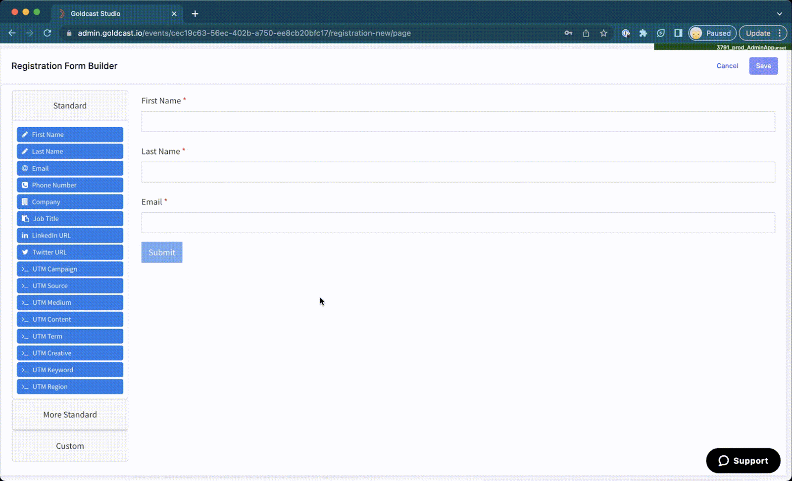
To create a registration form:
- Log in to Goldcast Studio with your credentials, and open your preferred event.
- Navigate to Registration → Page & Form using the left sidebar.
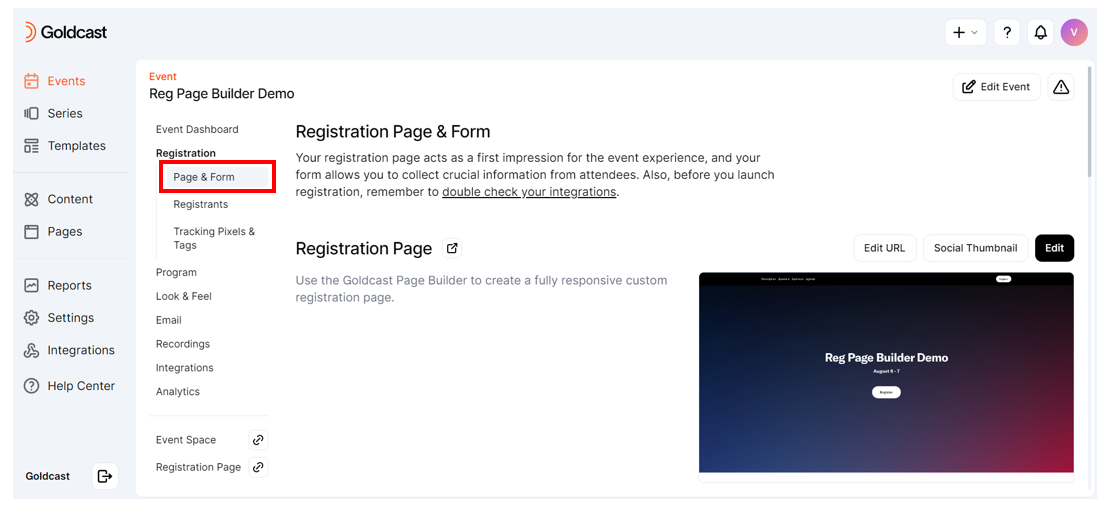
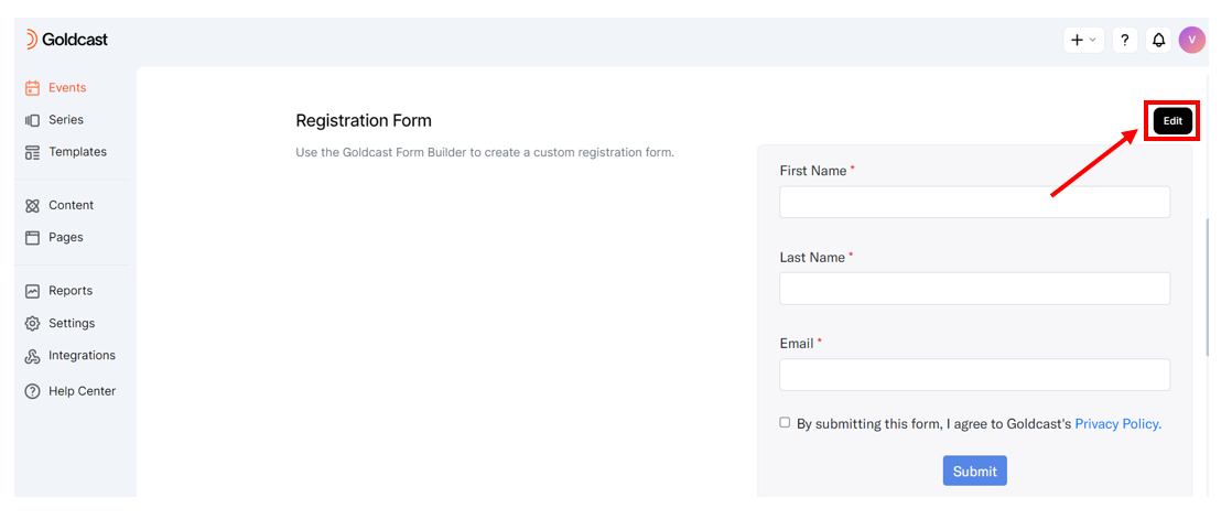
- Scroll to the Registration Form section.
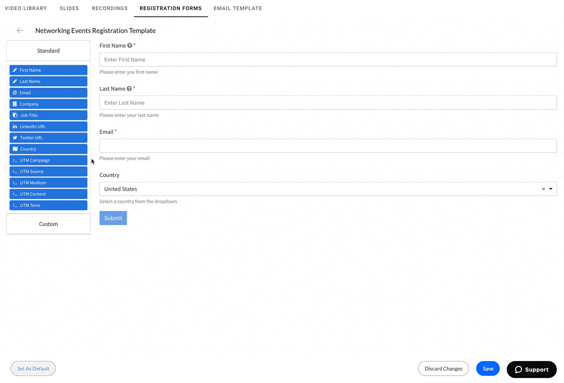
- If you have created your event from scratch, the Registration Form displays default fields: Email, First Name, and Last Name.
- If you have created your event from a template, the Registration Form displays the fields you saved in your template.
- Click the Edit button in the registration form section Registration Form to open the Form builder.
- Use the form builder to add, remove, and rename fields.
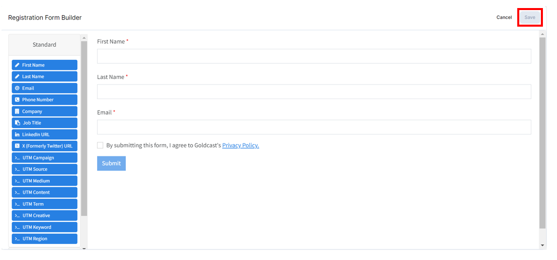
- Once done, click Save.
Heads up! The fields Email, First Name, and Last Name are mandatory on the Goldcast registration form. Based on your requirements, you can drag and drop additional fields from the Standard and Custom sections. For example, you can include fields such as Company, Job Title, LinkedIn profile, etc.
For Webinars
To create a registration form:
- Log in to Goldcast Studio with your credentials, and open your preferred webinar.
- Click Registration in the tabs at the top of the page. Next, click the Form subtab and click the Edit Form button.

- If you have created your event from scratch, the Registration Form displays default fields: Email, First Name, and Last Name.
- If you have created your event from a template, the Registration Form displays the fields you saved in your template.
- Use the form builder to add, remove, and rename fields.

- Once done, click Save.
Heads up! The fields Email, First Name, and Last Name are mandatory on the Goldcast registration form. Based on your requirements, you can drag and drop additional fields from the Standard and Custom sections. For example, you can include fields such as Company, Job Title, LinkedIn profile, etc.
Editing the registration form
Adding a field
To add a field, simply select it from the fields list, then drag and drop it into your form.
Editing a field
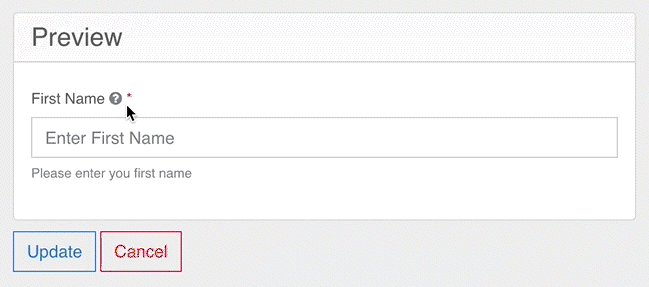
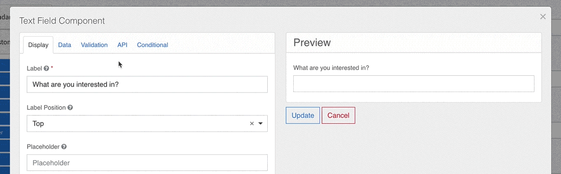
To edit a form field, hover over it, and select its edit icon ( ). A window will appear. From here, you can make changes as needed. See the Editing Form Fields section below for in-depth instructions on editing fields.
Moving a field
To move a field within a form, hover over it, select its reposition icon , and drag it to reorder your fields.
Duplicating a field
To duplicate a field, hover over it and select the copy icon .
.
A new duplicate icon  will appear to its left. Select this icon to complete the duplication process.
Deleting a field
To delete a field, hover over it and select the red delete icon . See the section Editing Form Fields below for in-depth instructions on editing your registration form.
Previewing registration form
Once you have finished creating a registration form for your event, we recommend previewing it on the event registration page before sending event and registration info to potential event guests.
To view the registration form:
For Events
- Log in to Goldcast Studio with your credentials, and open your preferred event.
- Navigate to the Registration → Page & Form section.
- Click the arrow hyperlinked next to the Registration Page section. This opens the registration page.
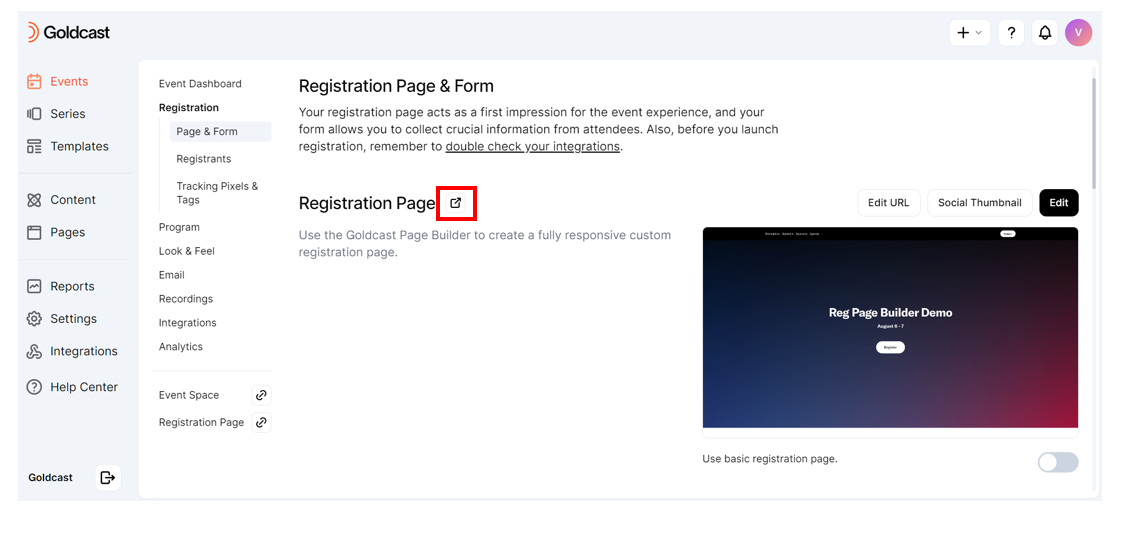
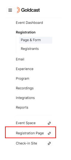
- Alternatively, you can also click the Registration Page tab on the left sidebar.
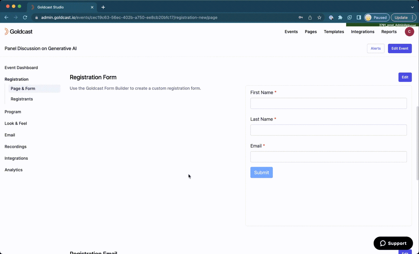
- Click the Register CTA to view the preview of the form.
For Webinars
- Log in to Goldcast Studio with your credentials, and open your preferred webinar.
- In the Event tab, scroll to the Registration Page card and click the View button.

- This opens the registration page.
- Once on the Registration Page, click the Register CTA to view the preview of the form.

Editing form fields
Display
The following is a list of Display settings offered by the Form editor.
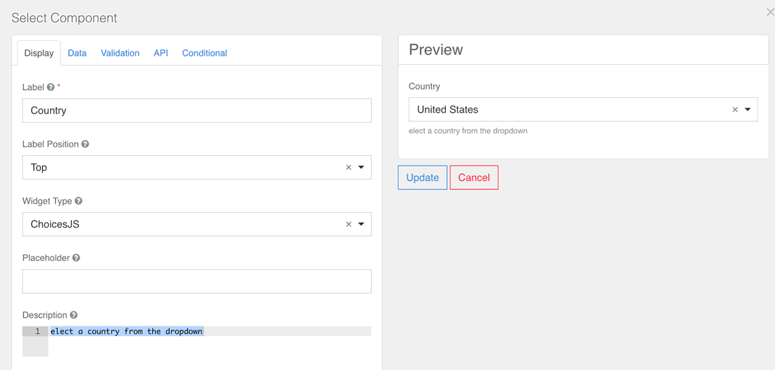
Label
The name or title for a component.
Label Position
The position of the label for that field. The following position options are available:
| Top |  |
| Left (Left-aligned) |  |
| Left (Right-aligned) |  |
| Right (Left-aligned) |  |
| Right (Right-aligned) |  |
| Bottom | 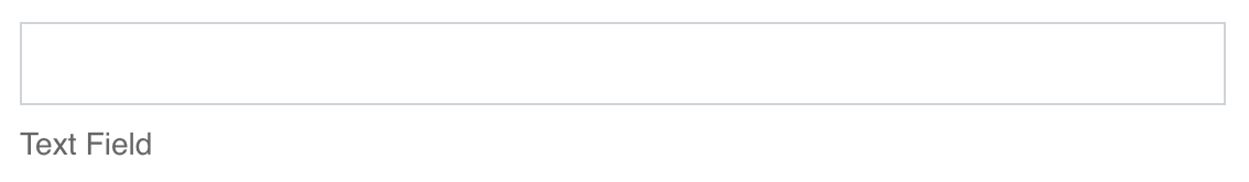 |
Placeholder
The placeholder text that will appear when this field is empty.
Description
The Description is text that will appear below the input field.
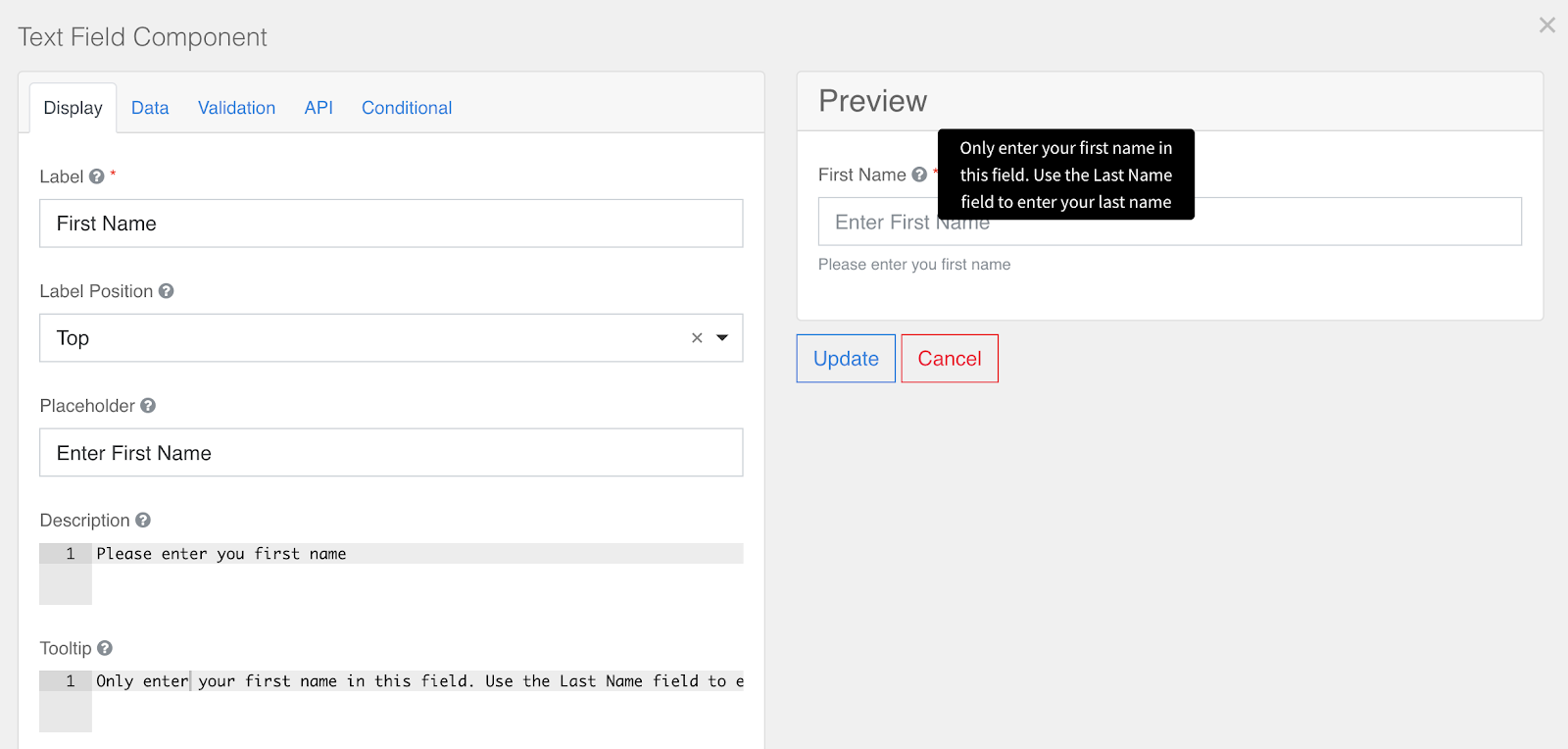
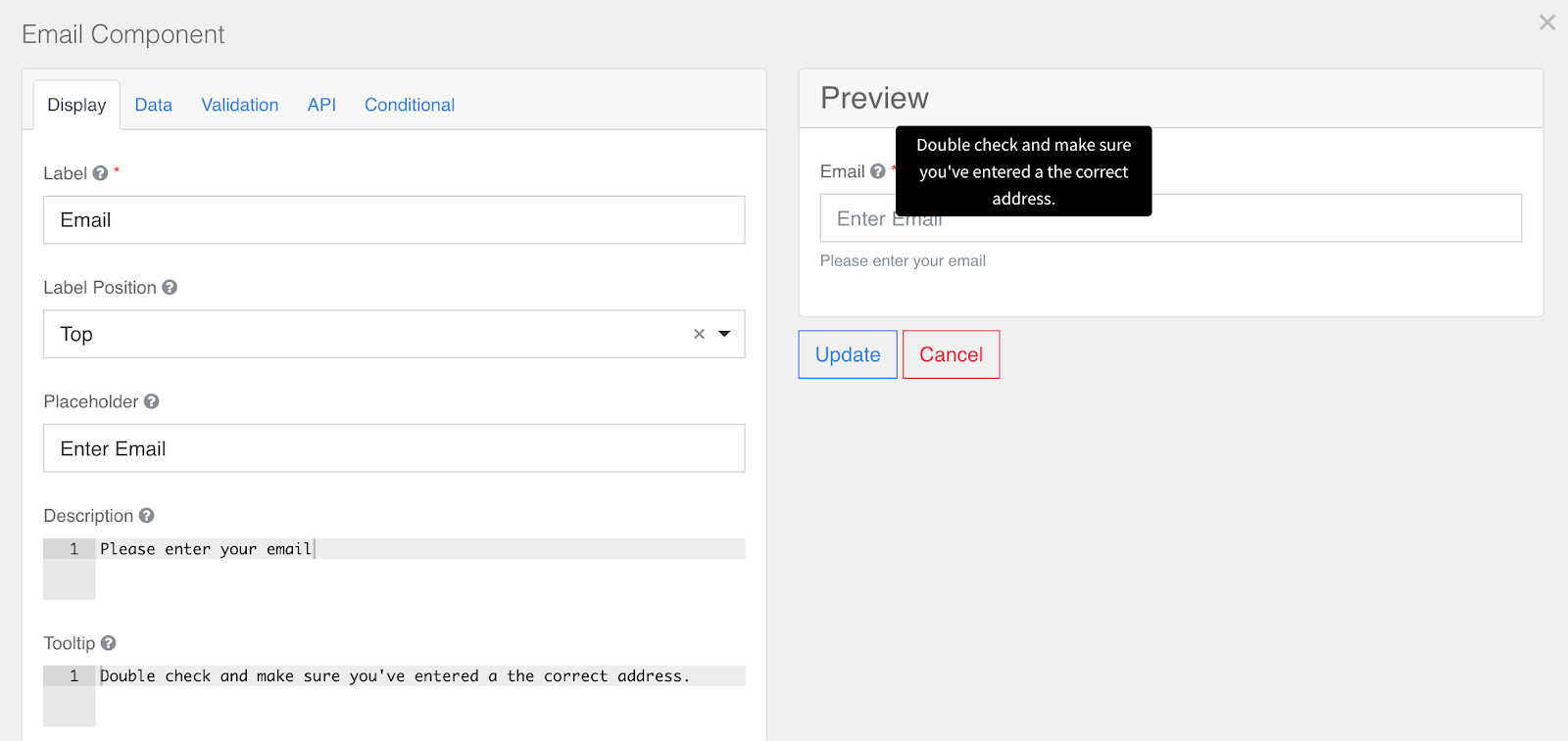
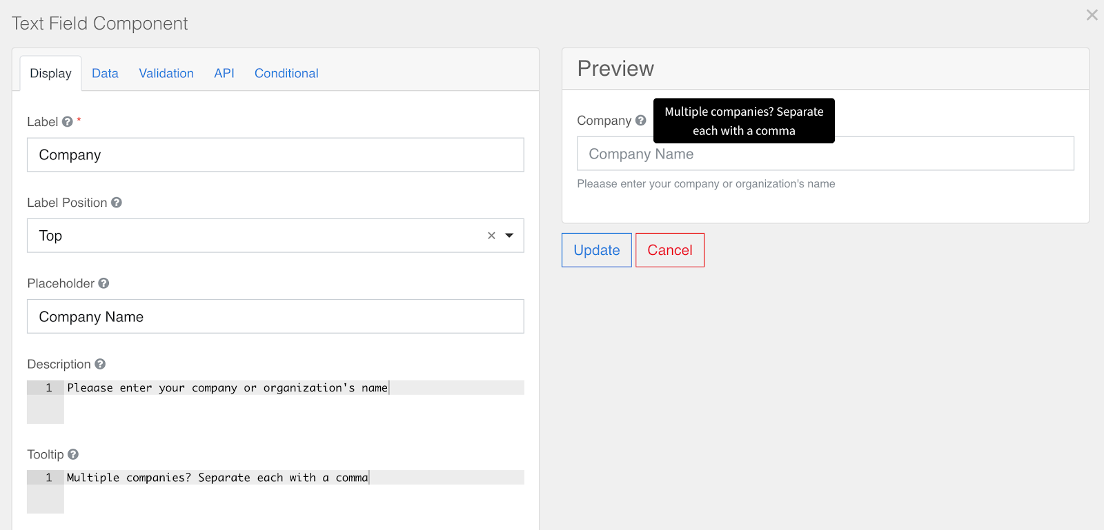
Tooltip
Adds a tooltip icon to the side of this field.
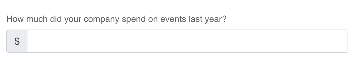
Prefix
The text to show before a field. For example, adding a "dollar sign" ($) before a field for questions about spending. Prefixes are not included in your submission data.
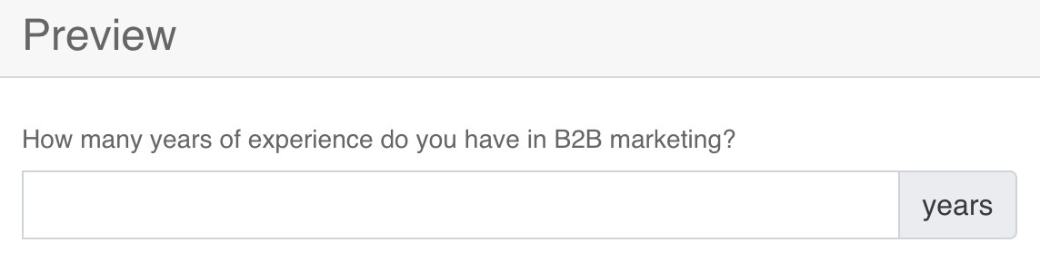
Suffix
The text to show after a field. For example, adding "years" after a field for a question about years of experience. Suffixes are not included in your submission data.
Widget
Widgets are the display UI used to input information into a field. Widgets are frequently used with the following Field Components:
- Text Field
- Select
- Time
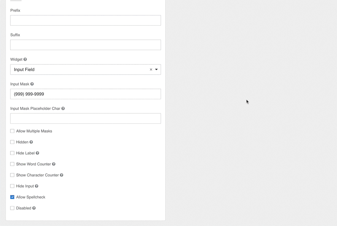
Input Masks
An input mask helps the user with input by ensuring a predefined format. For a phone number field, the input mask defaults to (999) 999-9999.
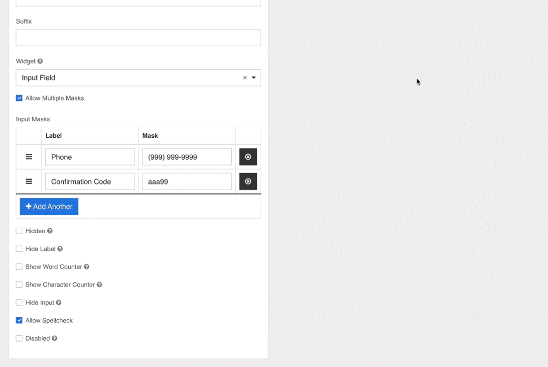
Allow Multiple Masks
This setting allows you to set multiple input masks for the field. The user selects the mask from a dropdown list, which dynamically switches the mask for the field when selected.
Hidden
The hidden field setting hides fields once a form has been rendered, while still allowing them to capture form submission data.
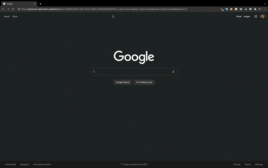
- Enabling this setting is particularly useful for hiding a field and automatically filling it with URL parameters. For example:
- If an Organizer wanted users to register for their event using a specific email, they could do so by hiding the Email field and sending out personalized registration links that include registrant emails. Once a link is clicked, its associated email will then populate the hidden Email field automatically.
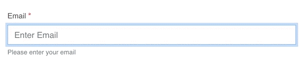
- The image below uses an Email field that has not been hidden to demonstrate how this process works.
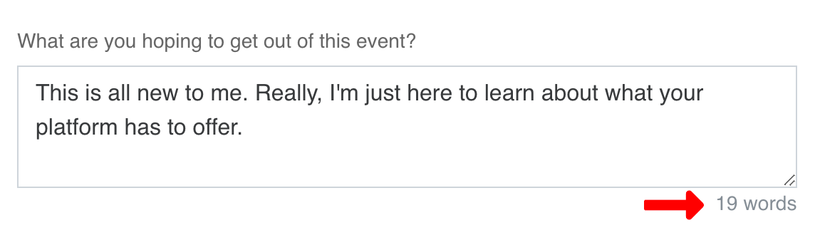
Show Word Counter
Displays a live count of the number of words that have been entered into a field.
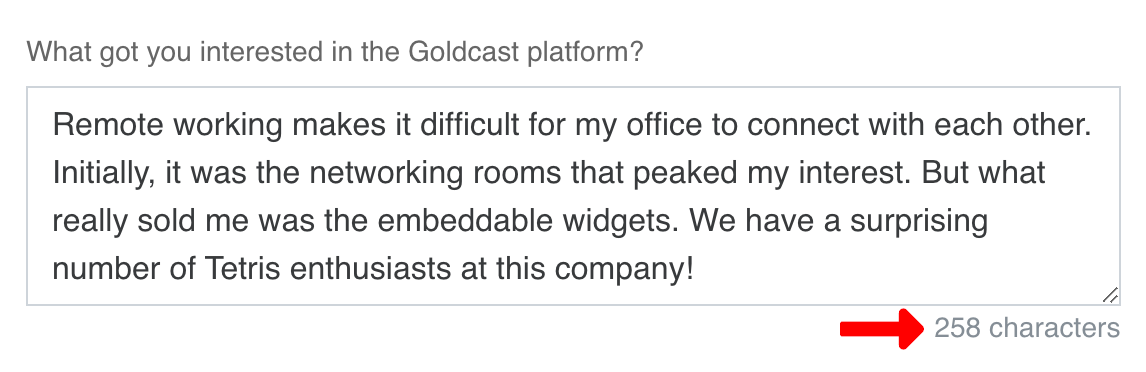
Show Character Counter
Displays a live count of the number of alphanumeric characters that have been entered into a field.
Hide Input
Hides the input when viewing a form from the front-end browser. While the input may be hidden, the information itself will not be encrypted once a form has been submitted. As such, you should not use this field for passwords or any other sensitive information.
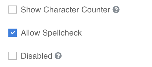
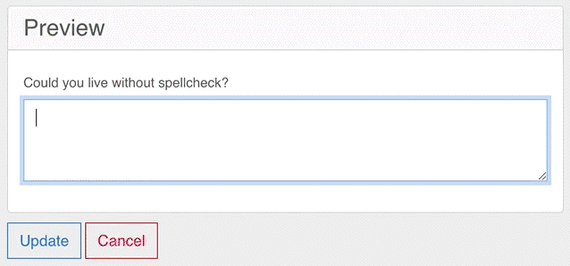
Allow Spellcheck
This setting will enable spellcheck for a field.
 |
 |
Disabled
This feature disables a field on a form. You may wish to use it in instances where a field is no longer necessary after a certain date. Disabled fields are indicated by a greyed-out field that does not accept input.
Heads up! If you select a Theme other than Primary and Secondary for the Submit button component, the default color of that theme will be applied to the background of the Submit button. This means the background colour of the Submit button won’t be affected on the Event or Series Registration Page.
Form data
URL Parameters
URL Parameters are used to collect information about how users interact with a webpage. In this situation, these parameters are specifically used to collect data about user form-field responses.
- Organizers may wish to use URL parameters to create customized links for their event registrants that pre-fill registration fields with basic information such as their first name, last name, and email. This can be accomplished by adding URL parameters with defined values to the end of a registration link.
Values
A value can be defined as any piece of data pertaining to a form field. Examples of values include:
- Default Values
- Radio and Select Box response options
- Data Source Values
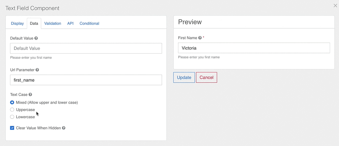
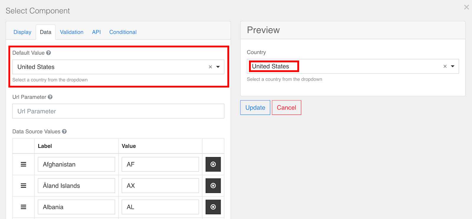
Default Values
Default values are values that are automatically populated into form fields when a user first visits your registration page. The Default Value field is available for all form components.
Heads up! Assigning a Default Value to a form field will override any Placeholder text you have entered.
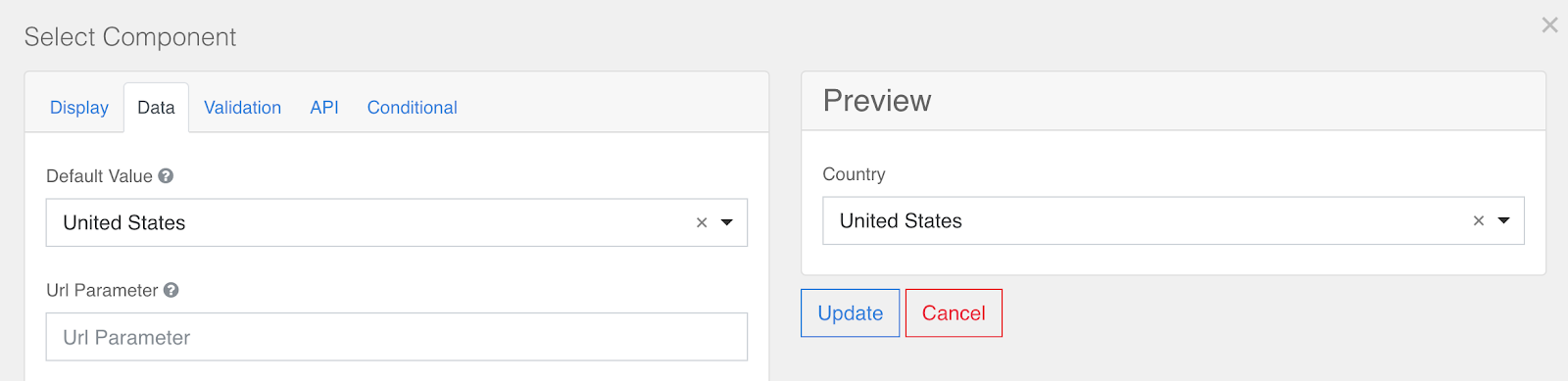
Data Source Values
Data Source Values are values that are used as a data source for Select components. For a complete list of the default values to use for different countries and US states, refer to this article.
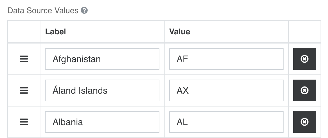
Heads up! The information entered into the Label fields will appear in the Select dropdown, while the information entered into the Value fields is sent to the Goldcast database after a registration has been processed.
Text Case
The Text Case feature can be used to automatically change the case of any alphabetical text that is entered into a field.
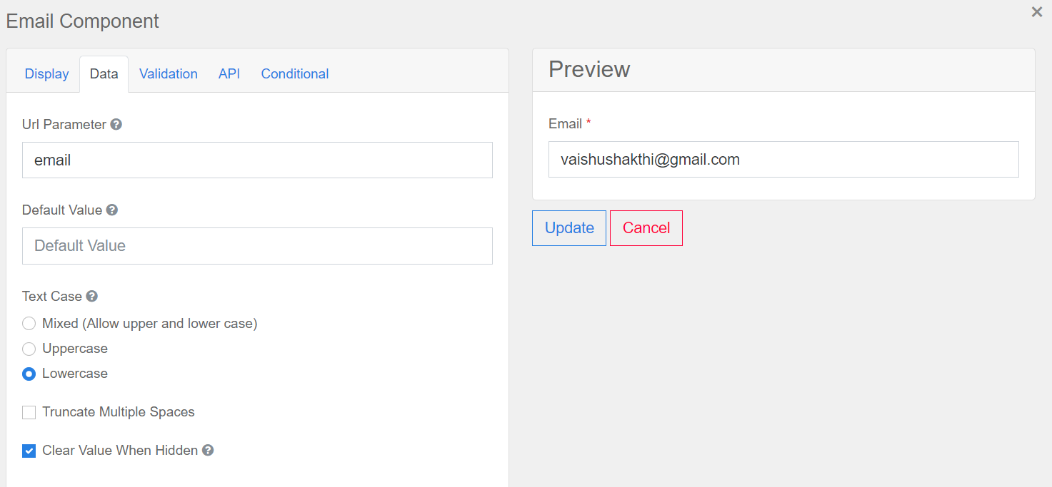
Clear Value When Hidden
When this feature is enabled, any value entered into a form field will be deleted when the field is hidden. This feature is particularly useful if you are using conditional logic, as fields may toggle between visible and invisible depending on the rules you have established.
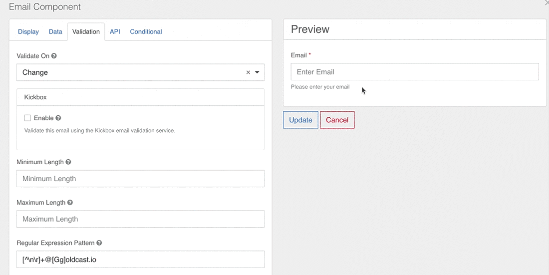
Validation
The validation tab is where you set requirements and conditions that must be met for a field input to be accepted.
Required
Fields with this checkbox enabled are required to submit a registration form.
Validate On
This feature is used to determine when and how frequently information entered into a field is tested for validation. It is particularly relevant if you are using a regular expression pattern or any of the minimum or maximum length requirements to establish rules for a valid field entry. This feature has two options:
-
Change - Runs a test for validation every time a new character has been entered or deleted from a field.
-
Blur - Waits until the user has finished entering information into a field to run a validation test.
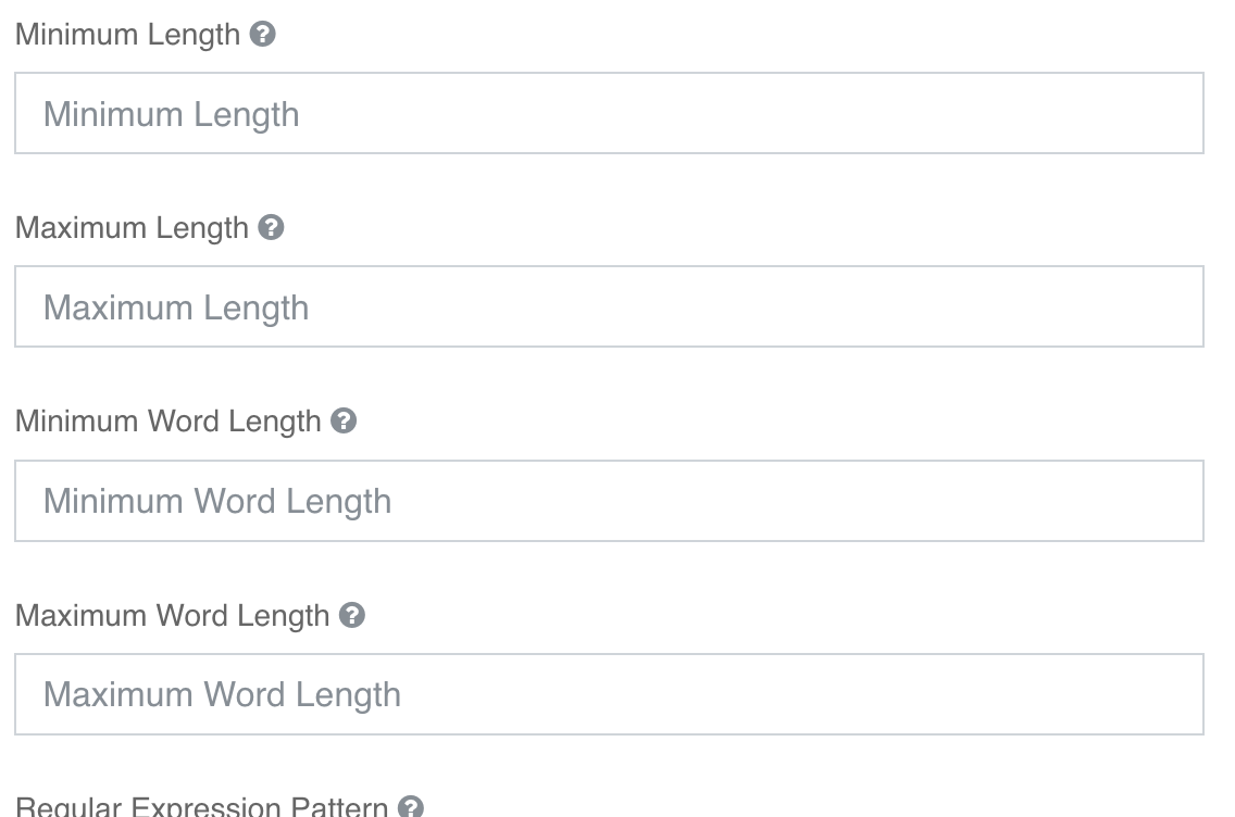
Minimum & Maximum Length
The minimum and maximum length fields can be used to set requirements for how long or short a field input can be.
- Minimum and Maximum Length can be used to establish the minimum and maximum number of characters that can be in a field response.
- Similarly, Minimum and Maximum Word Length determine the minimum and maximum number of words that can be in a field response.
Limit Registrants to Certain Email Domains - Regular Expression Pattern
Pro Tip: Learn more about Regex patterns and how to use them on your registration form.
The Regular Expression Pattern field allows you to establish a set of rules that a field value must pass to be considered a valid entry on your Registration form.
- This field may be useful for organizers planning company events that can only be attended by staff members. For example, the regular expression pattern below is structured so that an Email field can only accept email addresses ending in goldcast.io:
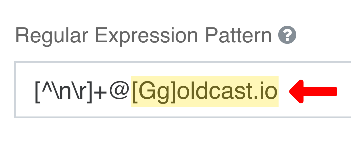
If a user enters an email address that doesn't match the criteria outlined in the regular expression pattern, they will receive an error message. If the address does match the criteria, it will be accepted.
Regex can also be used to ban specific email domains from registering. For example, if you want to prevent attendees from registering with their personal emails, you can use the Regex pattern:
^(?!(?:.*@(?:gmail\.com|yahoo\.com|hotmail\.com|outlook\.com)$)).*$
In the example below, when an email with a Gmail, Yahoo, Hotmail, or Outlook domain is entered, the verbose error message in the Custom Error Message input will show and prevent the user from completing the registration process.
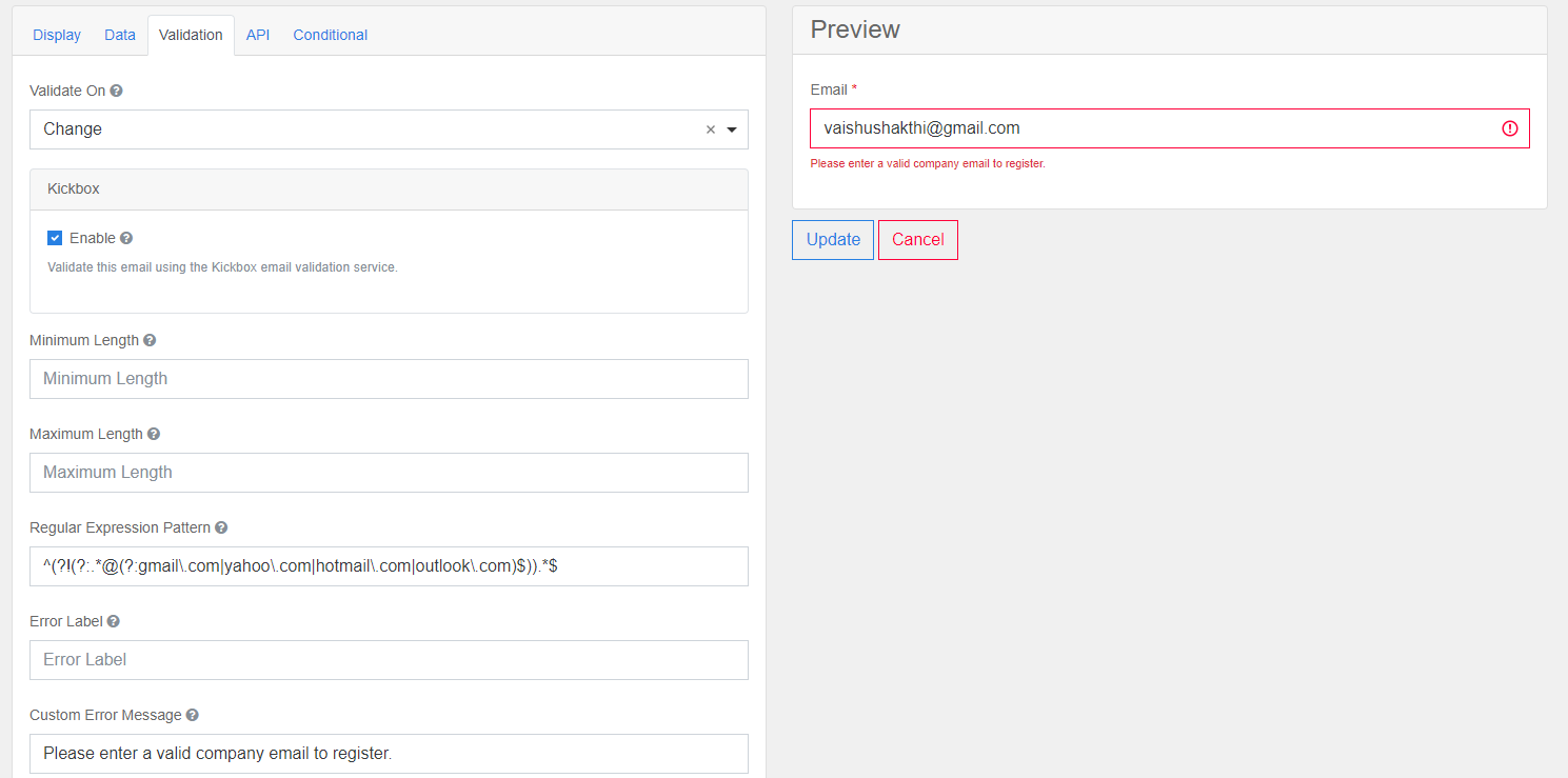
Note: The regex example above is case-sensitive and only bans the domains if they are entered in lowercase. The regex can be modified to make it not case-sensitive, but a simpler solution is going to the Data tab and selecting the Lowercase Text Case option for the email field. This will force emails to be entered in lowercase.
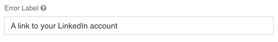
Error Label
Error messages for invalid responses incorporate the field label by default.
Text entered into the Error Label field overrides and replaces the field-label text.
 |
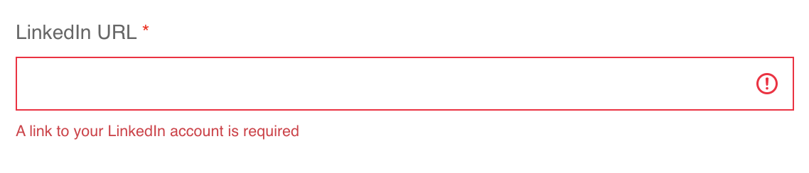 |
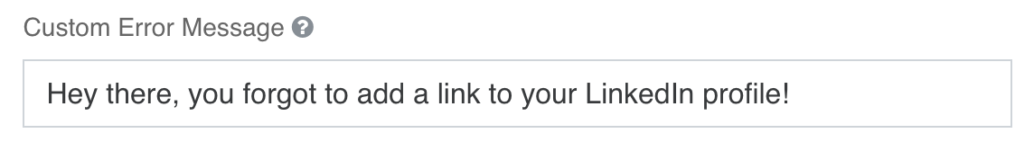
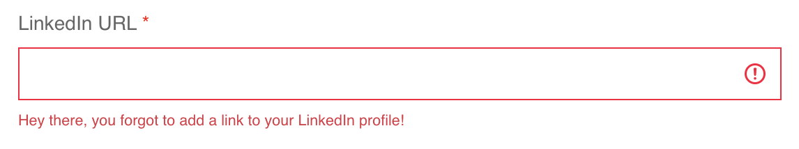
Custom Error Label
Custom Error Labels allow you to create custom error messages for form fields. Unlike the Error Label field, any text entered into this field will override the default error message entirely.
 |
 |
Component API
The Property Name of a field, rather than its Label in the Display tab, is what identifies data collected from the field during registration. Imagine the fields on your form as buckets and every registrant as someone who walks by and drops a piece of information into each bucket. The Property Name is the name of a bucket and is used to retrieve the information dropped into it.
When data from the form field is submitted, it will be stored in Goldcast's backend under the property name you have chosen. Additionally, it will also be used as the column header for the data collected by this field on the Registration details table in the pre-event dashboard and the registrants table in your event's registrants tab.
If you want these column headers to show up with spaces in them, use underscores in your Property Name where you want the spaces to appear.
The Property Name on a standard field component is preconfigured and connects to an existing Goldcast property name. We recommend you don't change the Property Name of a standard field.
If you are using a custom field component, you can change the property name by going to the API tab in the form component settings. You can either connect the field to an existing Goldcast property name by using one of our Standard Properties or if no property matches your use case, you can create your own. Because the Property Name is an identifier, be sure to make it succinct and unique.
Heads up! The Property Name field is case-sensitive.
Conditional Components
Conditional components require an API Property to be configured. Any form component can use conditional logic to determine when to hide or display itself. The settings for a conditional field are configured on the component itself and can be found by viewing the Conditional tab within the components settings.
The conditional logic is based on the following rules:
- Each field can be hidden or displayed
- Field visibility is dependent on another component defined within the form
- The logic is activated when a value is entered into the configured field that meets the criteria you've defined in its conditional logic settings.
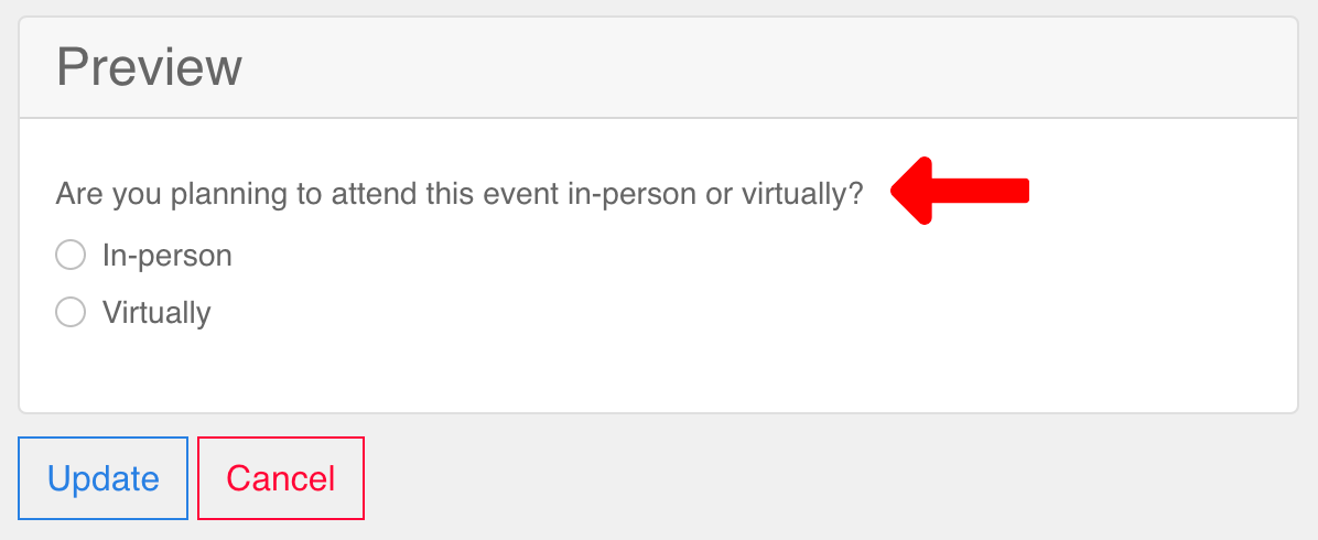
For example, let's say you are having a Hybrid (in-person/virtual) event and would like to collect information on dietary restrictions from in-person attendees only. In this scenario, you would start by creating a Radio field that asks registrants how they plan to attend your event. Pay attention to the Value field for each response, as you will need this information in the future.
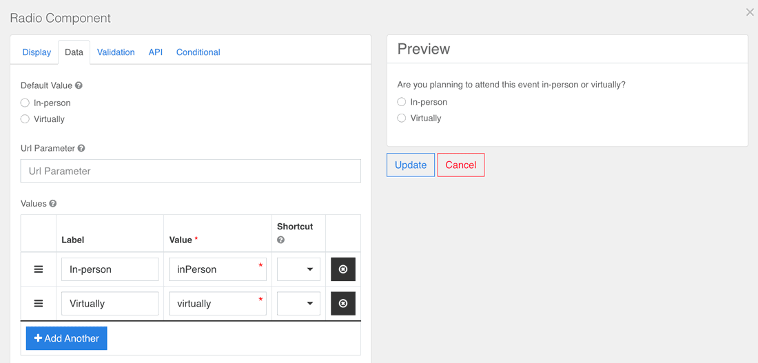
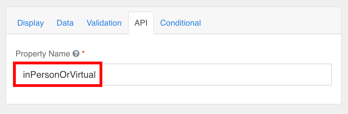
Additionally, make note of the component's Property Name, as it will make searching for the correct form component easier later on. This information is located in the API tab.
Once you've added the Radio field to your registration form, your next step is to create either a Select Boxes or Radio component that prompts registrants to specify their dietary restrictions.
Once you've set up the field, navigate to the Conditional tab and complete the following steps:
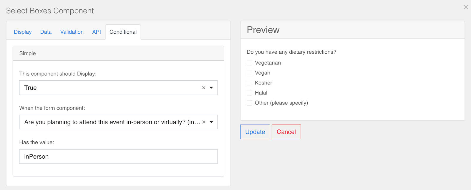
- Select True from the This component should Display dropdown. This will keep the field hidden on your Registration form until the conditions you are establishing have been met.
- Next, use the API property name mentioned earlier to search the form and select the appropriate form component from the When the form component dropdown.
- Finally, since you would only like this field to display for in-person registrants, enter the "inPerson" value from the Radio field into the Has the value field.
- Click the Update button to apply these changes.
Once this process has been completed, you may wish to repeat it for any follow-up questions. In this scenario, the follow-up question will only apply to those with dietary restrictions not listed.
 |
 |
Once you've finished, verify that your conditions have been set up correctly from the Registration page for your event.
Standard fields
First & Last Name
The First and Last Name fields are where registrants can enter their full name. Both fields are required by default. While their API Property Names cannot be changed, all other settings can be customized as needed.
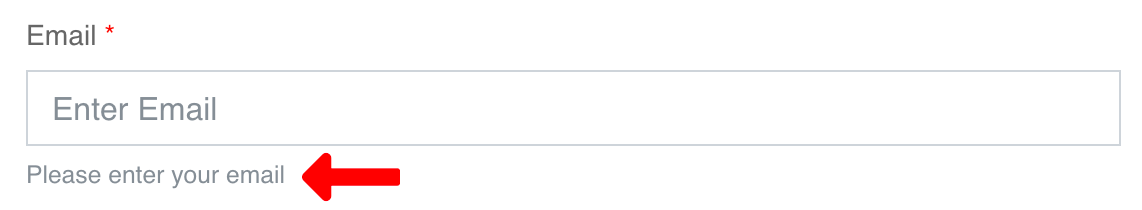
The Email field is where a registrant should enter their email. Once they have done so, it will then confirm that the email address is valid. This field is required by default. While its API Property Name cannot be changed, all other settings can be customized as needed.
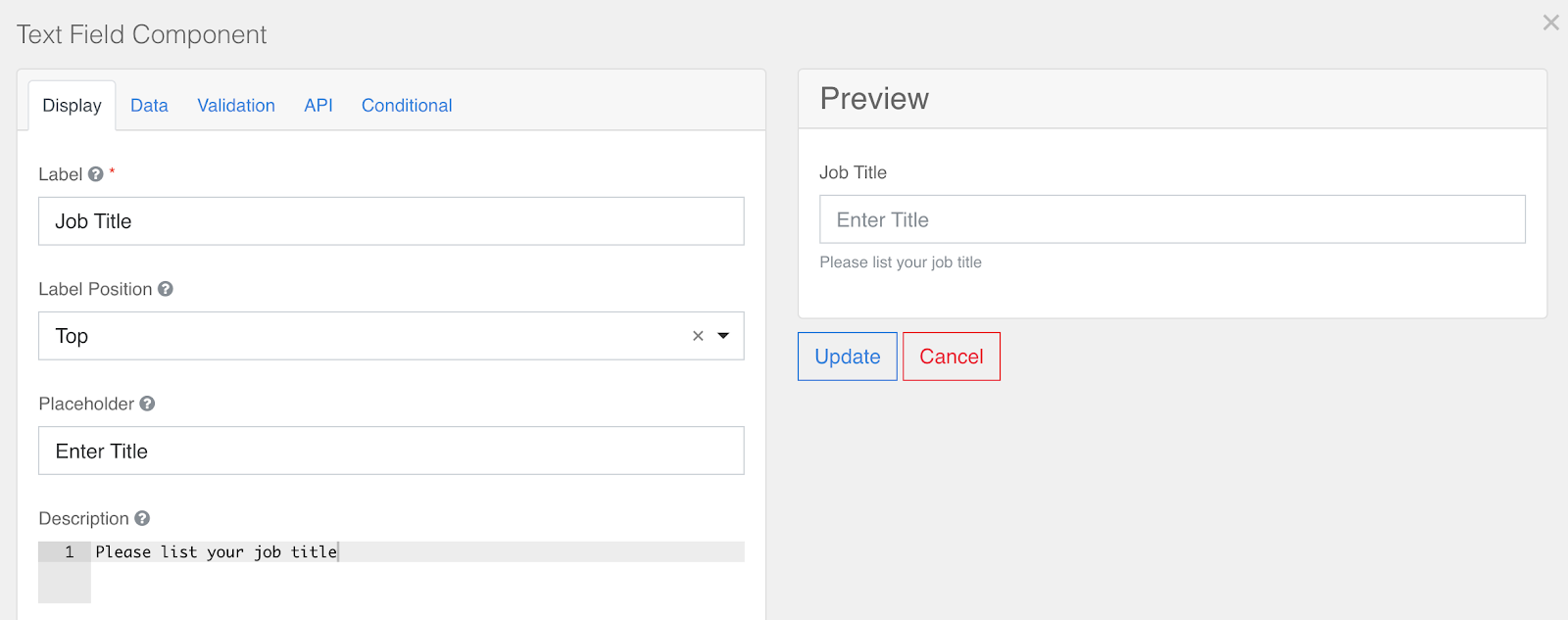
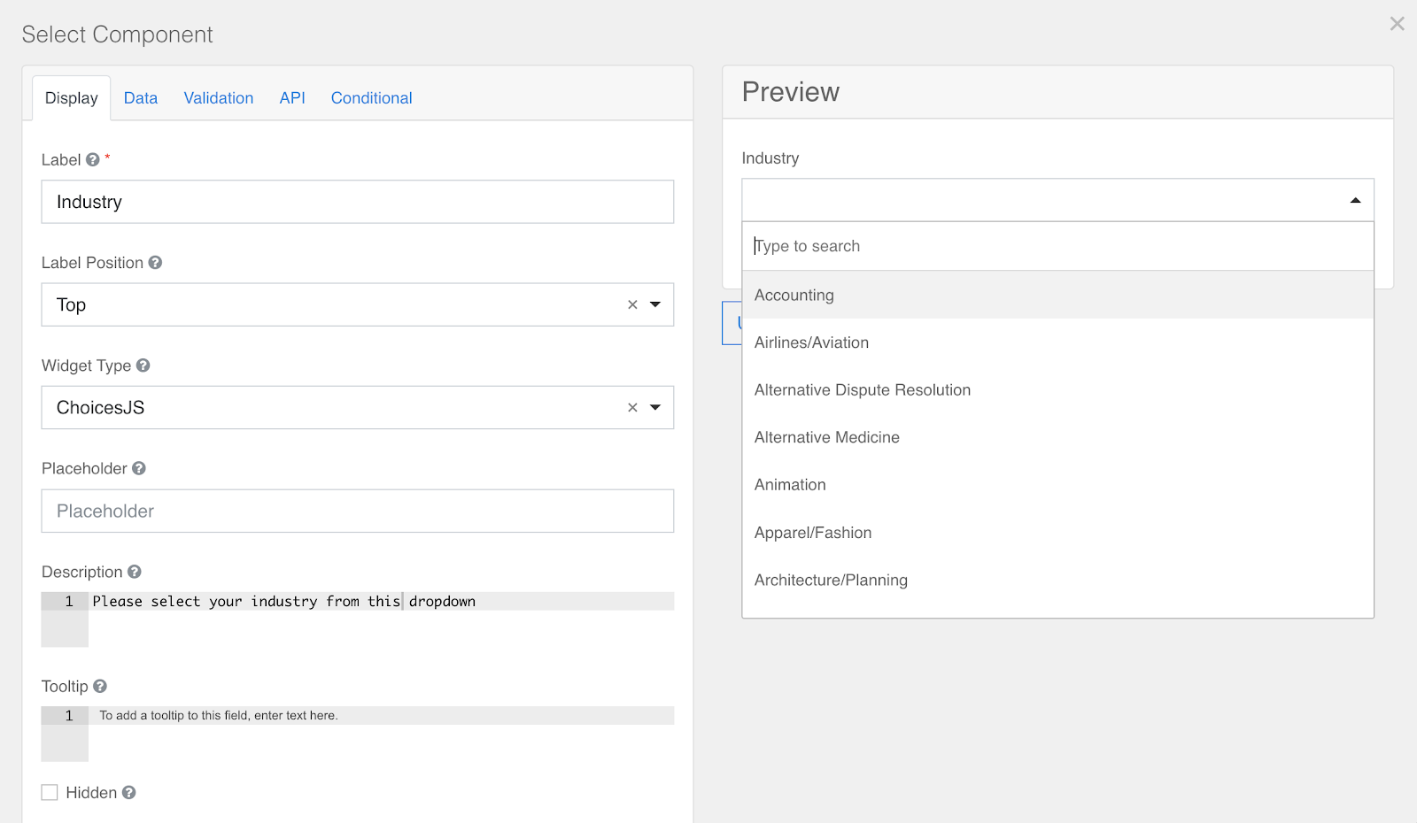
Company, Job Title, and Industry
The Company, Job Title, and Industry fields are where registrants can list their professional title, company affiliation, and relevant industry.
The Industry field is a dropdown component and comes preconfigured with a list of industries. You can add, remove, or modify Industries from the dropdown in the Data tab.
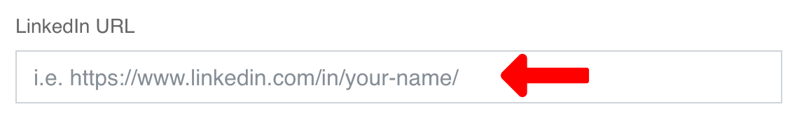
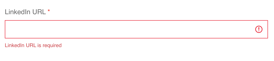
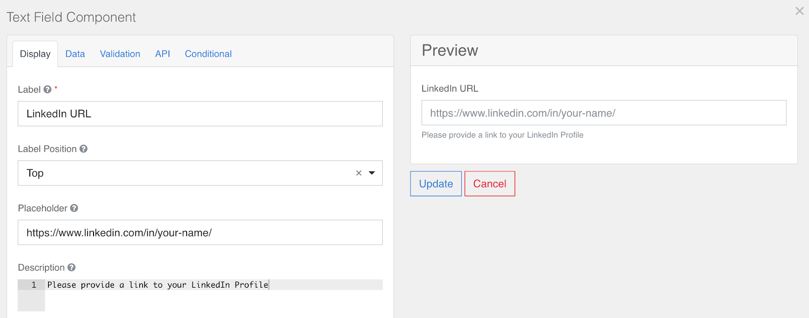
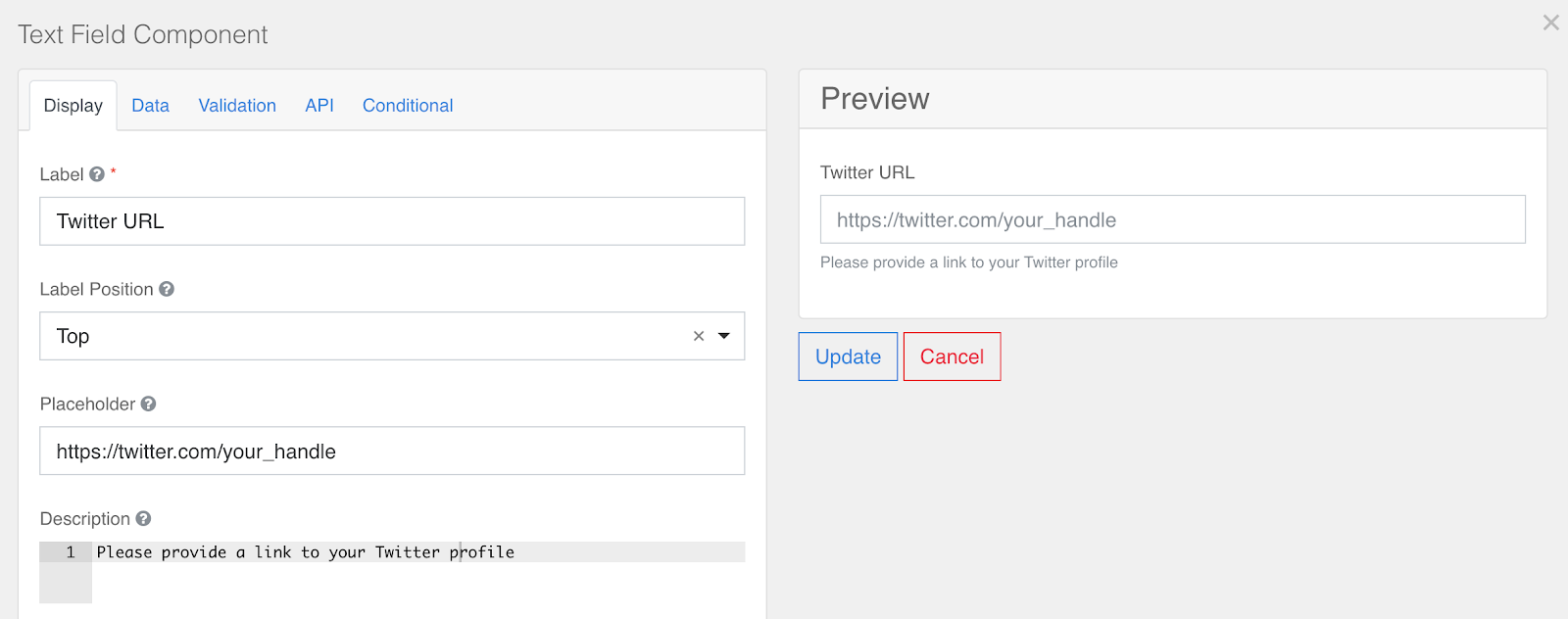
LinkedIn and Twitter URL
The LinkedIn and Twitter URL fields accept and confirm that a valid profile URL has been entered for each respective field.
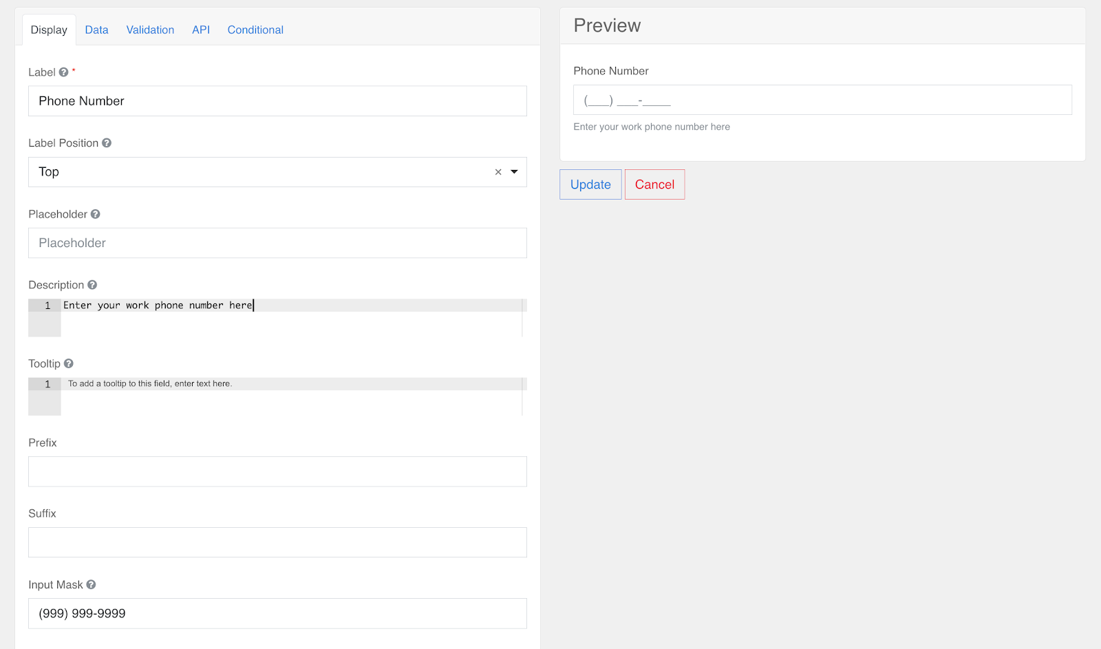
Phone Number
The Phone Number field, by default, accepts a standard 10-digit American phone number. You can change this component to accept different formats by changing the Input Mask of the component.
Age
The age field is a numerical only field that will only except characters 0-9. This field can be used to get the age of a registrant.
Location Fields
The location-related fields can be used to get location information from a registrant.
The location fields include the following fields:
- Street Address
- Address Line 2
- City
- State
- Zip Code
- Country
For example, if your event is shipping out a swag package to registrants, you can use the location fields to get all the pieces of a customer's shipping address.
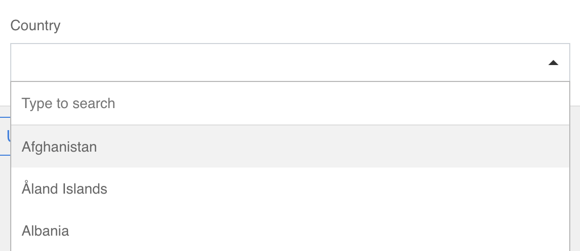
Country
The Country dropdown provides a list of countries. Registrants may select one country from this list.
Under the Data tab, you will find a list of Data Source Values. These values determine what countries appear in your dropdown.
If you would like to add an additional value that is not on the list, simply scroll to the bottom of the tab, select the Add Another button and add your value.
- Label – The text that will appear in your Countries dropdown.
- Value – The information that will be sent to the database for your Goldcast Org.
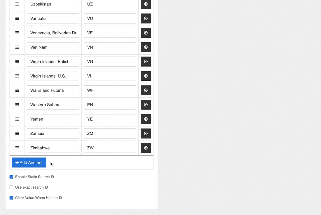
For the complete list of default labels and values for country and US states, refer here.
UTM Tracking
UTM codes track campaign performance and can be used to better understand the factors that contributed to people registering for your event. Once Goldcast collects UTM data, it can be sent to any platform integrations you have installed, along with other registration information.
Our form builder allows you to track the following UTM parameters:
- Campaign – utm_campaign
- Source – utm_source
- Medium – utm_medium
- Content – utm_content
- Term – utm_term
- Creative – utm_creative
- Region – utm_region
- Keyword – utm_keyword
Tracking Custom UTM Parameters
You can also create custom form fields to track UTM Parameters that our standard fields don't cover. To do this, drag and drop the Hidden field from the Custom section of the component library on the left.
The field editor will automatically open after this. Write an apt label for your UTM tracking field. This field will be hidden on your rendered registration form, so the label will just be seen in the form builder.
Next, click on the data tab and enter the UTM Parameter that you want to track. Say you want to track a UTM Parameter utm_purpose. The data tab for your UTM Purpose tracking field should look like this:
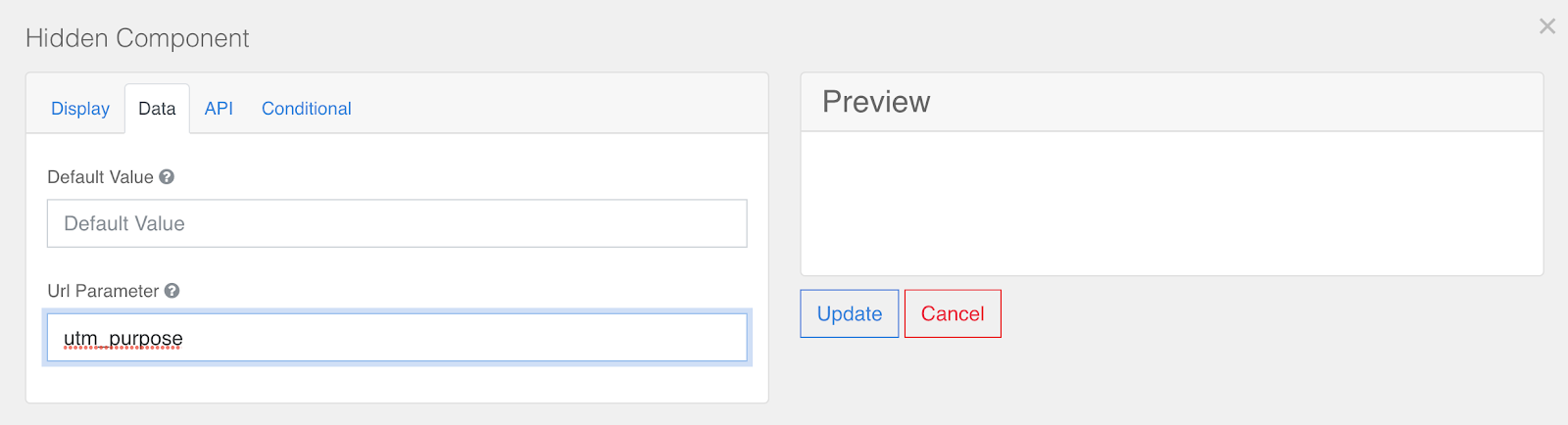
Adding utm_purpose to the Url Parameter input makes this form field track the variable assigned to the utm_purpose URL parameter in your registration page's URL. For example, if your registration page URL is "www.registration.goldcast.io?utm_purpose=marketing_campaign," then this form field would have the value "marketing_campaign."
Note: Data collected from a custom UTM tracking field will not be automatically sent to your downstream integrations. Please reach out to Goldcast Support for more help setting up mapping between your custom UTM tracking field and your connected integrations.
Pronouns
The Pronouns field is a dropdown component with options He/Him, She/Her, They/Them, and Other. Like any dropdown component, you can add, remove, or modify the options from the Data tab in the field editing interface.
Data Share Consent
The Data Share Consent field is a checkbox field that can be used to ask registrants for approval to use and share the data collected on them through the event with third parties. If you are looking for opt-in consent from eventgoers to share their data, use this form component.
Visa Required
The Visa Required field is a checkbox field that may be used if you are putting on a hybrid event and have international attendees. Someone traveling across borders to attend the in-person part of your event may need a temporary Visa. You can use this component to see which of your registrants need Visas.
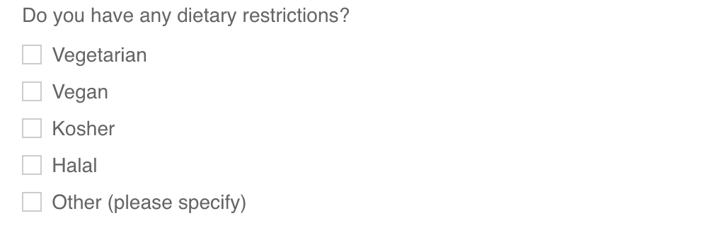
Dietary Restrictions
The Dietary Restrictions field is a dropdown component that collects information on registrants' dietary restrictions. This may be used if you are putting on a hybrid event and will be serving food at the in-person component of your event. You can add options to the dropdown in the Data tab after opening the field editor.
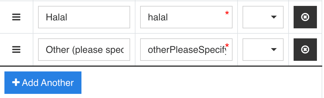
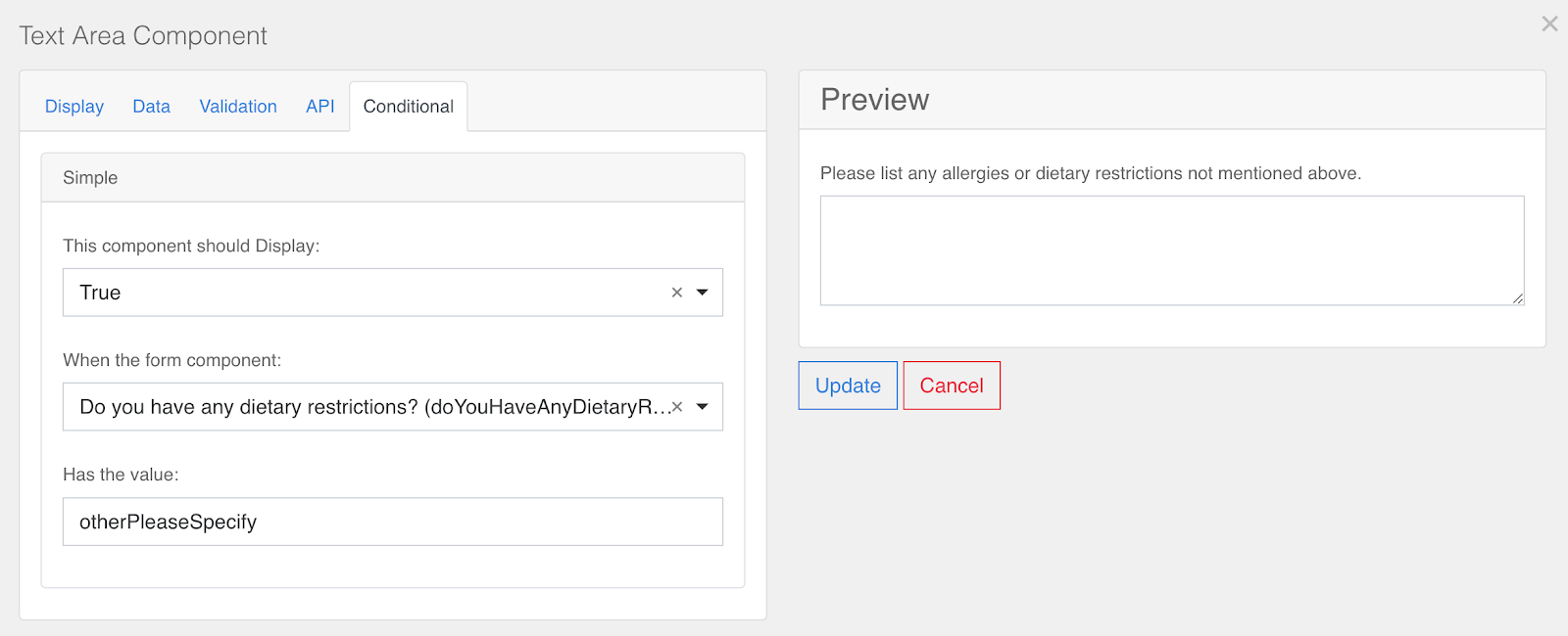
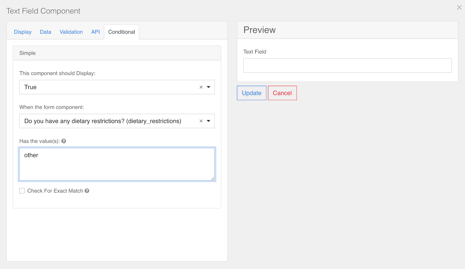
If you're worried about not having options for all sorts of dietary restrictions, you can make your form display a text field when a registrant selects the "other" dietary restriction option. To do this, drop the Text Field form input from the Custom section of the component library right after the Dietary Restrictions field on your form. Label this component something like "Please list your other dietary restriction(s) here".
Next, click on the Conditional tab. We want this form field to display when the Dietary Restrictions component has the value "other". The configuration for this condition is shown below
An "other" form field will need to have a separate mapping set up to send data to integrations. Contact your CSM for help setting this up.
Accessibility Needs
The Accessibility Needs field is a dropdown that lets you see if any registrants have accessibility needs that you can accommodate. Like any dropdown field, you can add, remove, or edit options in the Data tab of the field editor. You can also conditionally display a text input for registrants who select "other."
Look at the steps for conditionally showing an "other dietary restrictions" text input above or Conditional Components section of this guide to get an idea of how you can do this for accessibility needs.
Registrant Type
The Registrant Type is a dropdown field that lets you categorize registrants into different groups.
Maybe you want to differentiate customers and prospects who register for your event. In this component, you can create two registrant types: customer and prospect, and registrants will select which they are.
In the Goldcast registrant data tables, you'll then be able to sort and filter each registrant type and even send out unique email communications to each registrant group.
Additionally, you can create form questions that display conditionally based on a registrant's type. This will allow you to ask different questions to each type of registrant and collect different information from each type. See the Conditional section on this help doc to learn how to show form fields conditionally.
Custom fields
Besides the standard fields, you can also include the following custom fields on your registration form to capture specific information:
Text Field
Use it to capture short, general text input. Permits only single-line responses.
Text Area
This field is similar to the Text Field form component; however, it has a multi-line input field that captures longer text.
Number
Use this field to collect precise numerical data. It can only take inputs in the form of a number value type. You can configure the field to specify decimal places, decimal requirements, thousand separators, etc.
Use Case: To collect the registrant's years of experience, team size, and other quantitative metrics.
Password
This field has the same options as a text field component; however, it displays asterisks when a value is entered.
Select
This field displays a list of values in a dropdown. Registrants can select one of the listed values.
Use Case: To get registrants to select their industry, job title, company size, etc.
Select Boxes
Use this field when you want registrants to select more than one answer for a question.
Use Case: To collect registrants' interest areas, webinar topic preferences, etc.
Radio
This field allows registrants to select one value from a list of options. It is ideal for mutually exclusive inputs.
Use Case: To get registrants to select their preferred main course, such as vegan, vegetarian, chicken, seafood, etc.
Checkbox
The checkbox component accepts text values and allows users to select whether to check or uncheck a box when completing a registration form.
Use Case: To get registrants to agree to newsletter/marketing subscriptions
Hidden
A hidden field is still a part of the form; however, it is not visible on the form itself. Our UTM Tracking fields are configured using this field component.
URL
The URL component accepts and confirms that a valid URL has been entered based on the parameters set up in the Validation tab.
Date / Time
Use the Date/Time form component to collect dates, times, or both dates and times.
Day
Use the Day component to get registrants to enter the values for a Day, Month, and Year using a number or select field type.
Time
Use the Time component to capture input time using different time widgets you would like to use.
Currency
Use the Currency component to display currency amounts on a form.
Tags
Use the Tags component to categorize items, such as identifying the interests of your event registrants.
Signature
When you include this component on your form, registrants can sign the field on a touch-enabled device or with their mouse or trackpad. Once signed, their signature will be converted into an image and stored with the form submission.
HTML Element
This custom field lets you display a single HTML element on your form. It is useful for configuring HTML tags on your form.
Use Case: To include hyperlinks on your registration form.

Columns
This custom field allows you to create visually flexible registration forms by dividing form fields across multiple columns. By placing related fields side-by-side, for example, First Name and Last Name, you reduce vertical scrolling and create a cleaner form.
Heads up! Make sure the total width of your columns adds up to 12 to span the entire row evenly and prevent fields from wrapping to the next line.
The following video depicts the steps to add form fields across multiple columns in the registration form:

For a more in-depth review of this template editor's features, we recommend checking out Form.io's documentation on Form Components.
Hyperlinks
How can I add a hyperlink to one of my form questions?
There are two ways to include a hyperlink on your registration form.
Method #1: Include the custom HTML Element field
Method #2: Use the <a> tag in the Label of a Form Field
You can insert an HTML <a> tag directly into the Label of a form field to include a hyperlinked text. For example, if you want to include a link to your privacy policy in the registration form, you can follow these steps:
- Open the Registration Form Builder, navigate to the Custom section and drag and drop the Checkbox component.
- Copy and paste the following in the Label field of the Checkbox component.
- Replace the Goldcast URL with your preferred one.
By submitting this form, I agree to Goldcast's
<a href="https://www.goldcast.io/privacy-policy" target="_blank">
Privacy Policy.
</a>- The hyperlink you want to include should be specified in the href= attribute in the <a> tag.
- The hyperlinked text is placed between the <a> /<a> tags.
<a href="https://www.example.com" target="_blank"> Linked Text </a>